
This exercise is going to walk you through a simple Bootstrap webpage that will take full advantage of Bootstrap’s responsive components and custom CSS to create a finished product that is fully optimized for both a desktop and mobile layout.
We’re going to cover a lot of ground, so get ready!
There are two different approaches for utilizing this lesson:
- Try it out in its entirety. Follow along with VS Code open and complete the entire exercise. This is fantastic practice that will help you feel more confident with Bootstrap and Project 2.
- Use it as a reference. As noted, this exercise covers a TON of ground. Feel free to refer back to it for a refresher. Obviously, each step builds off of what came before it, but you can still get a good idea of how to implement certain components and customizations by referencing the steps below.
All said, we’re going to cover the following:
- Using the Bootstrap Starter Template
- Adding local copies of Bootstrap’s CSS and JavaScript files
- Adding a Navbar
- Adding semantic elements
- Grid components
- Adding images to the grid
- Adding text to the grid
- Adding a logo to the navbar
After all the components are added, we’ll work on customizing those components and optimizing their design for a responsive, mobile layout. We’ll cover:
- Adding a
custom.cssstylesheet - Adding a Google Font
- Responsive typography
- Using the Inspector to identify CSS selectors
- Ordering columns
- Offsetting columns
- Implementing a media query
That’s a lot! But the good news is that none of it is very difficult and in the end you will have created a mobile-first responsive website that utilizes many of Bootstrap’s powerful components.
Ready? Here we go!
Getting Started
To get us going we’re going to create a folder for this exercise called “bootstrap-exercise.” Inside that folder we’ll create three more folders: css, js, and img. These will hold our CSS files, JavaScript files, and images.
Since this is just an exercise, you can save your bootstrap-exercise folder in your webdev folder on Dropbox, but there’s no need to upload it to the server.
Bootstrap Starter Template
Open Visual Studio Code and create a new file. Save it as index.html in the bootstrap-exercise folder that you just created.
Next, visit GetBootstrap’s starter page. Copy the code under QuickStart Step 2 and paste it into your index.html file
Add some components!
Let’s take a few minutes to add some Bootstrap components to our HTML document. First, navigate to getbootstrap.com and then click “Get Started.”
Add a Navbar
On the left side of the scroll down until you see the “Components” heading and then click the link for Navbar.
On the navbar page, scroll down just a bit until you get to the first example of a navbar. Copy the code (there’s a copy button in the upper right corner of the screen) and paste it into your HTML document under the opening <body> tag. This is what you’ll want to copy:
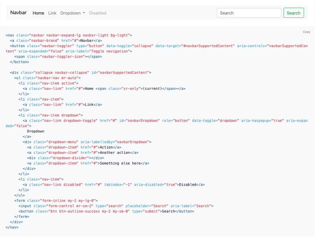
Next, let’s make the navbar a little fancier. Instead of the light gray background, let’s add some color.
Scroll down on Bootstrap’s navbar page until you get to the section titled Color Schemes. We’re going to pick the bright blue “primary” color scheme.
To do this, we’re going to copy the class selectors that refer to the navbar’s color from the middle navbar example. See the handy visual below for reference. The blue highlighted code is what we’re after.
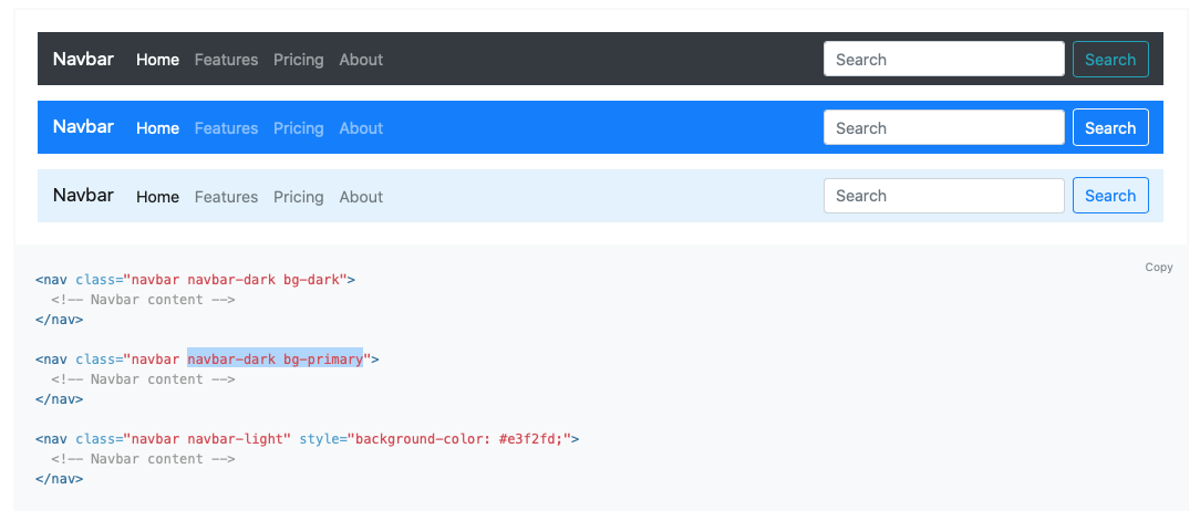
Once you’ve copied that code, return to VS Code and locate your navbar code. That very first line of navbar code has the two color classes that we’re going to replace. Again, see that blue highlighted code?

Replace navbar-light bg-light with navbar-dark bg-primary. Save and refresh.
You should now see a bright blue navbar!
Add Semantic Elements
Let’s take a moment to think about adding some semantic elements to our page so that it’s better organized and more accessible.
First, let’s wrap our navbar and <h1> tag in a <header> element. The opening tag will go before the <h1> tag, and the closing tag will go after the closing </nav> tag for the navbar.
Pro Tip: That navbar code is LONG, right? If you want to hide it from view you can hover next to the row number in VS Code. See that little downward arrow that appears? Click it and your navbar will collapse and the downward arrow will now be a right-facing arrow. You can expand it again by clicking the right-facing arrow. This is a great way to keep your sanity when you’re working with components that have a lot of code.
Next, let’s add a <main> element right under the </header>. The closing </main> tag will go right before your <script> files.
At this time you can also delete the default <h1> tag that contains the “Hello World!” We’re about to add a Jumbotron, so you can completely erase the <h1> element!1
Add a Grid Component
One of the most powerful features of Bootstrap is its responsive grid system. Let’s take full advantage of it and add some grid elements to our HTML.
There are a couple ways that you could approach this. First, you can visit the grid system page on Bootstrap’s website and copy and paste a grid element that looks appealing to you. Or you can hand write some code. Let’s practice that!
We’re going to create a container for our rows and columns2. Here’s what your code should look like:

Make sure to include that closing </div> tag!
This container is going to have two rows nested inside it. Again, here’s a handy visual.

A good thing to note here is that we are keeping our code organized by indenting nesting elements. This will make our lives so much easier!
Next, we’re going to add two columns to each row, but first, here’s a quick preview of where we’re headed: we’re going to create a layout with a two rows; each row will have two columns. In the first row, the first column will have an image and the second column will have some text. We’ll reverse the order in the second row. We’ll have some visuals to help us in a minute, but first just try to picture that layout in your mind.
Remember, when we’re sizing columns twelve is our magic number 3. If we want our image to take up less of the row than our paragraph we could make that happen by assigning one column a smaller size than the other, like this:
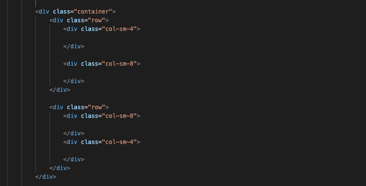
Again, pay attention to that indenting and make sure all your <div> tags have a corresponding closing tag!
We’ve also added a breakpoint to these columns so that the column size will apply when they are size small (small is defined by Bootstrap as bigger than 576px or roughly the size of a mobile phone screen in landscape orientation). Since we don’t have a bigger breakpoint specified, like medium or large, the layout will stay the same on any sized device that is 576px or larger.
However, when we shrink the screen to extra small, which will mimic the screen size of a mobile phone in portrait orientation (Bootstrap defines extra small as anything fewer than 576px wide) the columns will change their appearance and stack vertically. More on this later!
Okay, time to add some content to our columns!
Add Some Images
We’re going to add some images to this project, so download this image folder and make sure the contents end up in the image folder you created for this exercise. BTW, this exercise talks about Paris and the images USED to be of Paris. That is no longer the case because we lost Paris!! Can you believe that? For now, you should have some nice images from the North Carolina mountains to play around with, but feel free to download your own. But for purposes of this exercise pretend we are still in Paris.
In the first column of the first row, we’re going to add one of the images. We’ll want to make sure that we add appropriate alt text as well. Lastly, we’re going to want to make sure our image is responsive, so we will add a class called img-fluid.
Here’s what your image element should look like:

Repeat this process for another image adding it to the last column of the second row.
Lastly, we’re going to transform these images from squares to circles by visiting Bootstrap’s website, going to “Utilities,” and selecting “Borders.” If we scroll down on that page to the border-radius section we will see the code needed to turn our image into a circle. Copy the rounded-circle class and paste it right after img-fluid class for both images.
It’s important to note two things here. First, the two classes should be inside the same set of quotation marks: class="img-fluid rounded-circle".
The second thing to note is that the rounded-circle class only works to turn our image into a circle because our image was a square in the first place. If we had a rectangular image, we’d end up with an ellipse instead of a circle4.
Adding Some Text
To complete our layout we’ll add a <p> element to the second column in the first row, and the first column in the second row. In other words, both of the columns that we set to a size of 8.
To stick with our theme of Paris we’ll use a short passage from Victor Hugo’s classic novel, Les Misérables. Copy and paste it into a <p> element inside the two columns.
For Paris is a total. Paris is the ceiling of the human race. The whole of this prodigious city is a foreshortening of dead manners and living manners. He who sees Paris thinks he sees the bottom of all history with heaven and constellations in the intervals. Paris has a capital, the Town-Hall, a Parthenon, Notre-Dame, a Mount Aventine, the Faubourg Saint-Antoine, an Asinarium, the Sorbonne, a Pantheon, the Pantheon, a Via Sacra, the Boulevard des Italiens, a temple of the winds, opinion; and it replaces the Gemoniæ by ridicule. Its majo is called “faraud,” its Transteverin is the man of the faubourgs, its hammal is the market-porter, its lazzarone is the pègre, its cockney is the native of Ghent. Everything that exists elsewhere exists at Paris.
Add a Logo to the Navbar
Let’s add one more image before we call it a day! Wouldn’t it be nice if we could add a logo to our navbar?
To find the code to add an image (aka a logo) to the navbar, let’s go back to Bootstrap’s website and find the navbar component, then locate the code you’ll need to add an image. Take a few seconds to see if you can locate the code on your own. If you get stuck, click the ellipses.5
We’re going to copy the entire <img> tag and paste it into our navbar right inside the navbar-brand link– so it looks just like the screenshot below. Next, we’ll replace the image source with a handy Paris logo that is already in your image folder. Since our logo is a rectangle rather that a square, and we don’t want to distort it, let’s remove the width from the element and leave the height at 24. We’ll also add some alt text. The end result should look like this:

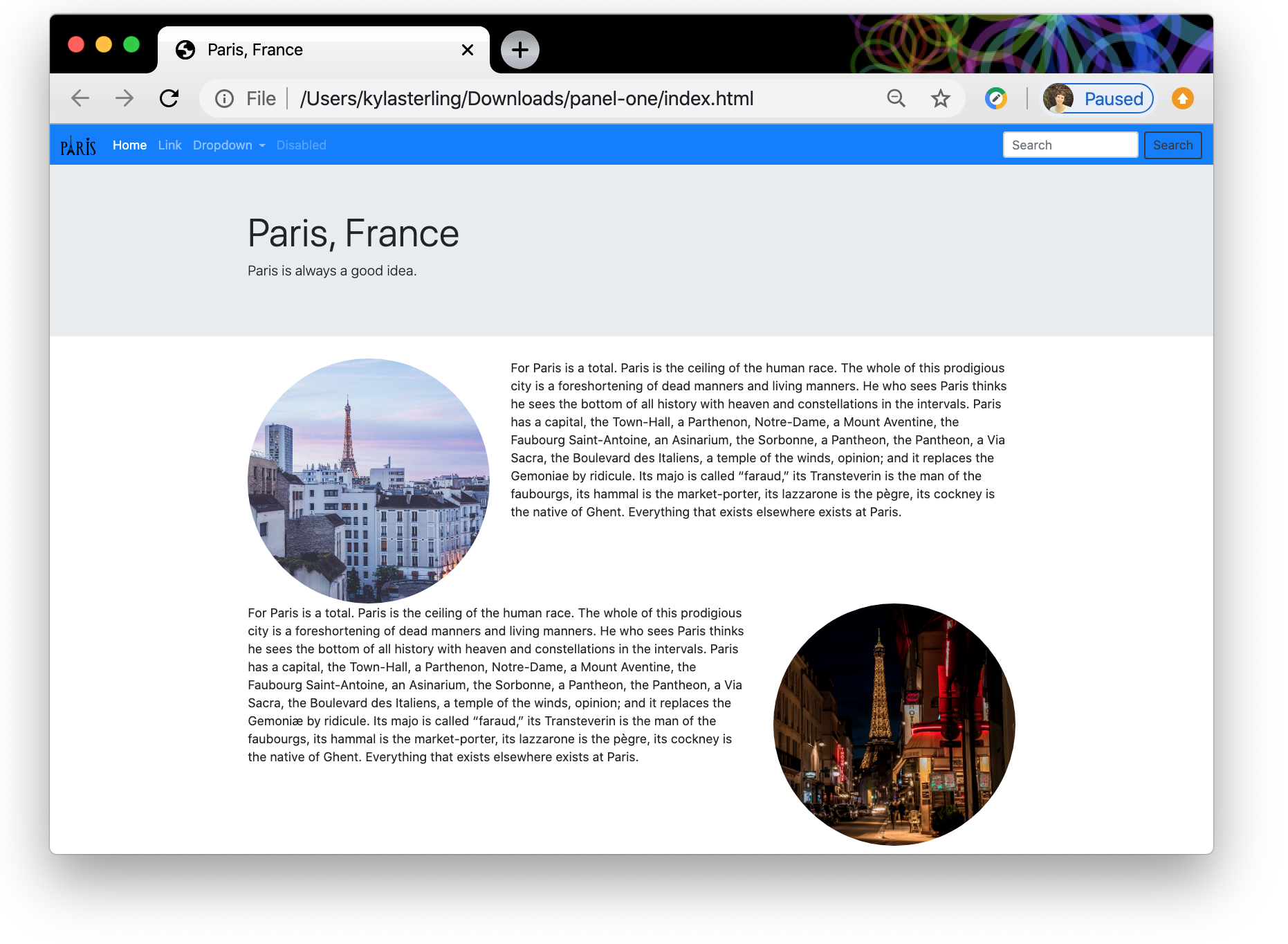
Okay, at this point we should have a nice navbar, Jumbotron, and responsive grid with two photos and some text. When we refresh and save our webpage it should look like this!
Customizing Components and Responsive Optimization
Custom CSS
We’ve got a decent webpage that we’ve built using a whole bunch of Bootstrap components— not too shabby! Let’s fancy it up a bit with some custom CSS.
To get started, open a new file in VS Code and name is custom.css. Save that file inside the CSS folder that you created for this project.
Next we’re going to link that stylesheet to our HTML document right below the bootstrap.css file. You should be a pro at linking external stylesheets by now, but if you need a refresher check out this resource.
Okay, now that we’ve linked our stylesheet, let’s style our webpage!
Add a Google Font
You might have already explored Google Fonts in a previous lesson, but now’s a good time to refresh your memory— or try them for a first time. Google Fonts are an easy way to customize your webpage by bringing in a non-system font.
In this example we’re going to style the <h1> element in our Jumbotron with a new font.
First, we’ll visit fonts.google.com to find a font we like. We’re going to go with “Squada One,” but feel free to pick whatever you like!
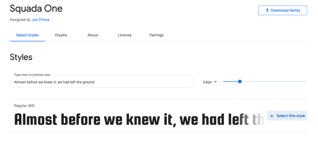
Click “select this style”. If you can’t see the font you selected, click the blue circle at the top of the screen to expand your selected font families (see below!).
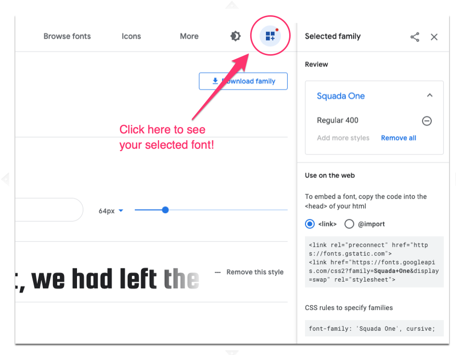
You’re going to copy the <link> tag for this font’s stylesheet (in the pink circle) and paste it into your HTML document between the <link> tags for the bootstrap.css stylesheet and the custom.css stylesheet in the <head> of your document.6
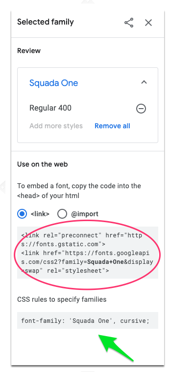
Next you’ll need to apply the font to your <h1> element. Copy the CSS rule from the Google Font website (indicated by the green arrow above) and paste it into your CSS file like this:

Save everything and refresh your browser. You should see a fancy new font in your Jumbotron!
Responsive Typography
Next, let’s make our paragraph text a little bigger. First, we might want to figure out the default font size of our <p> element.
How do we do that? We’ll we could try to dig around in the 10,000+ lines of code in bootstrap.css or we could use the Inspector to quickly find the answer.
In your Google Chrome window highlight any bit of text in your paragraph, then right click and pick “Inspect.” Our inspect window will appear:
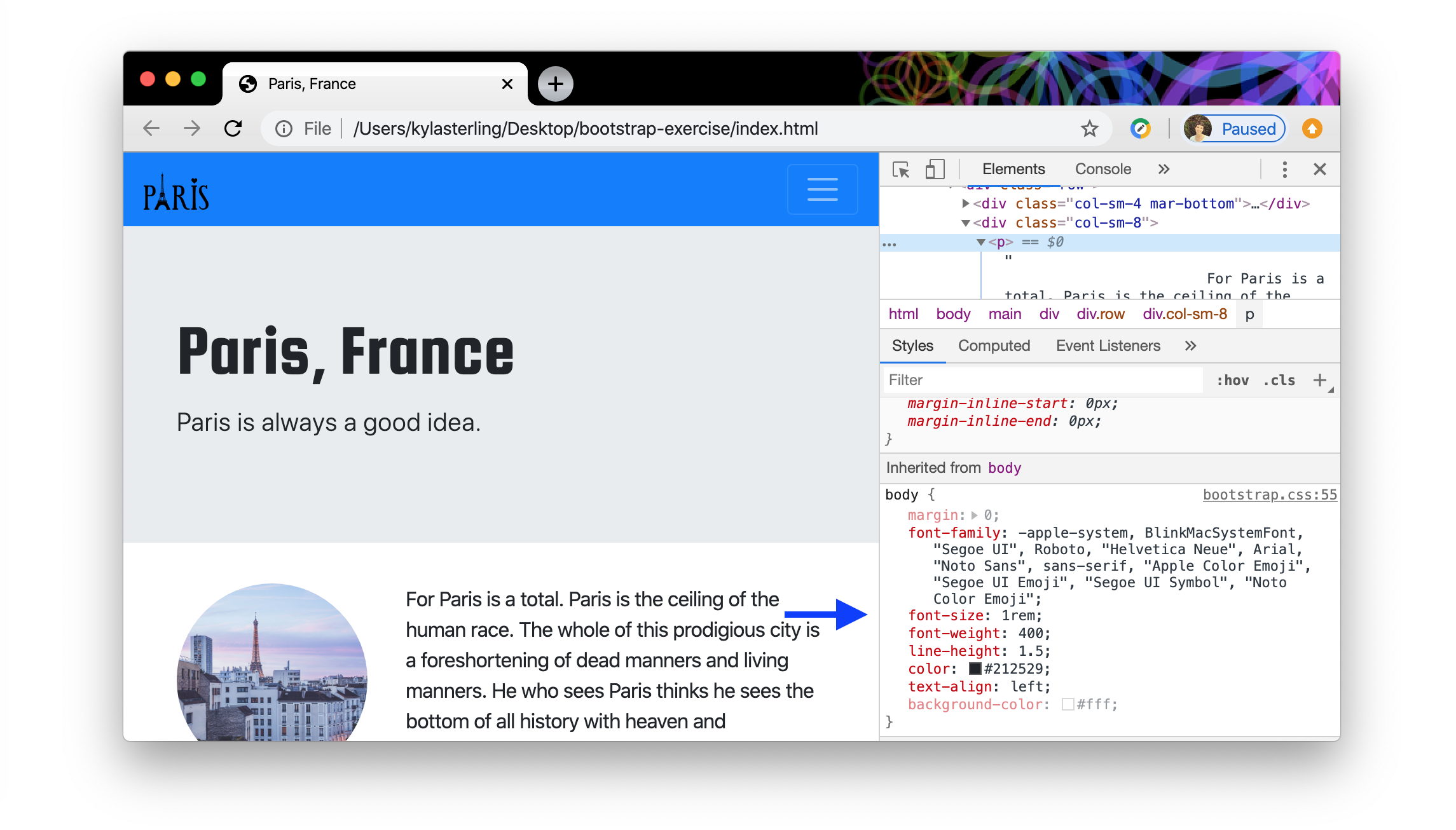
The “Style” panel is on the lower half of the screen. Scroll down a bit until you see the font size. In this example we see: font-size: 1rem.
You you might be thinking: What’s rem? That’s a great question! A rem, or root em, is a relative length unit, meaning it’s size is determined by it’s relationship to something else. Specifically, with an rem the size is relative to the font size of the root element.
The root element will automatically inherit the default font size of the browser, which is usually 16px. We can double check that using our inspector!
Let’s look back that the Inspector and click the Computed tab right next to the Style tab (see the blue circle below).
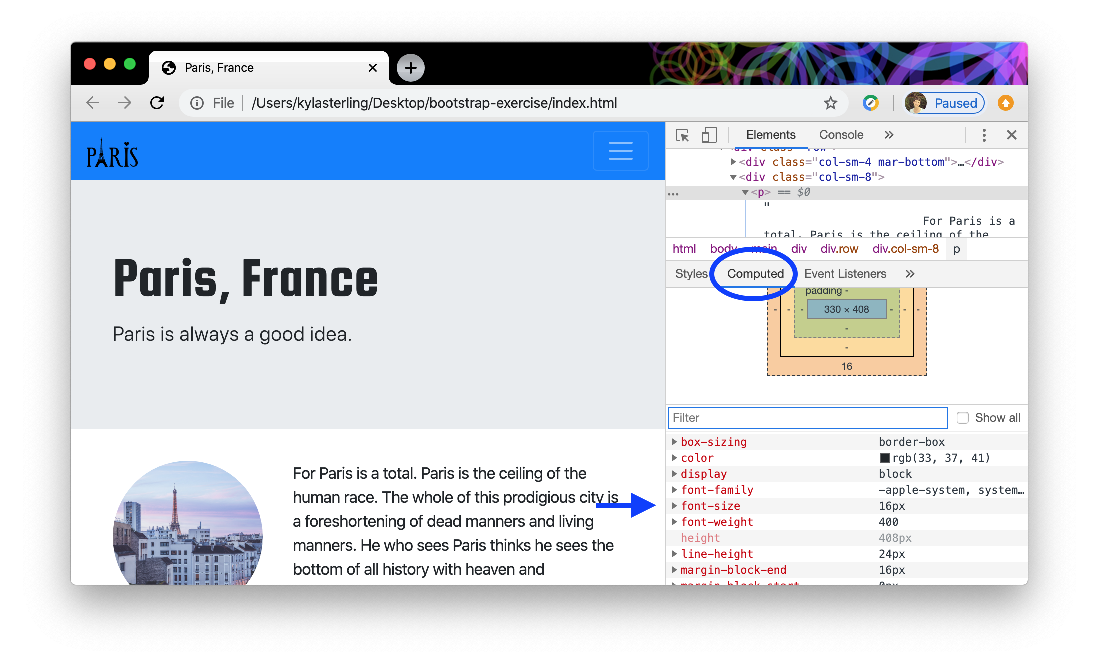
Scroll down in that panel until you see the font size (see the blue arrow). Notice how it’s 16px? Since the Style panel told us our font-size was 1rem we can conclude that 1rem is the equivalent of 16px.
That means that if we wanted our paragraph font-size to equal 32px we could change the font in our style sheet to 2rem. If we want something in between we could go with 1.2rem. Go ahead an make that change by adding it to your stylesheet like this:

In general, we should try to use relative units instead of fixed values when we’re designing responsively. This will ensure that our design systematically responds to any changes we make to the root element or any changes the user makes to their default browser settings.
You can learn little bit more about relative units here: Relative Units and CSS Units.
Using the Inspector to find CSS Selectors
We just used the Inspector to learn about our webpage’s default font size. The Inspector is a powerful tool to help us figure out the specific selector that Bootstrap is using to style an element. Once we know the selector, we can add a new style in our custom CSS document and overwrite Bootstrap’s styling. This will allow us to create unique, personalized layouts using Bootstrap themes and elements. We’ll use a simple example to try this out— we’ll change the color of our search button to something that shows up better against the blue nav bar.
In your Chrome browser hover over the search button (on the right side of your nav bar) and right click, then click “Inspect.” You’ll be able to see the CSS rules that have been applied to the button in the Inspector window. Make sure the search button is selected in the Elements window (see the red arrow) and then look down to the Style window to see which selector is setting the color property for the search button (blue arrow).
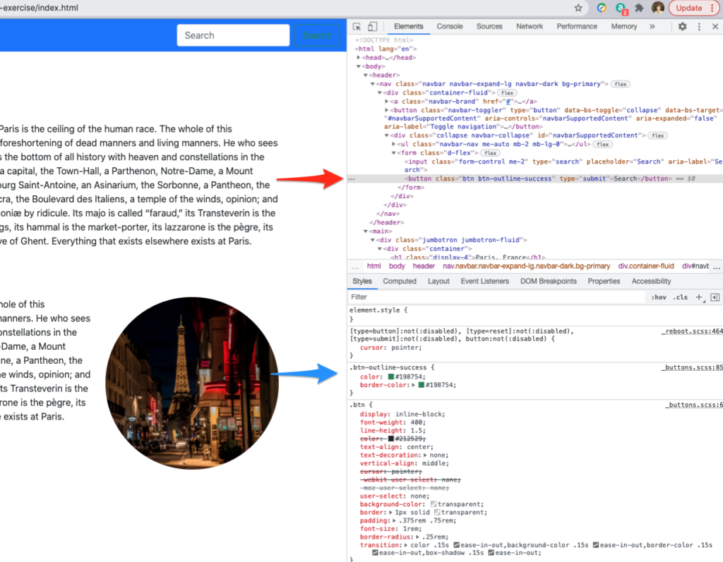
We can see that the selector .btn-outline-success. We can copy the entire .btn-outline-success rule into our custom.css to override the two color selectors.
Paste it in your CSS document. Now we can pick a color that is better suited to our design. Maybe a shade of yellow so that it is clearly visible against the blue like #ffdd5c. Go ahead and replace both hex codes. Your code should look like this:

Save and refresh your design in Chrome. That text should look yellow! But wait a second- hover over your search button. Do you see green pop up again? How do we fix that?
If you click the button again in the Inspector you can see the selector for the hover state of the button (AKA when we are hovering over it with our mouse) by clicking :hov in the style panel (blue circle below) and selecting :hover (green arrow below).
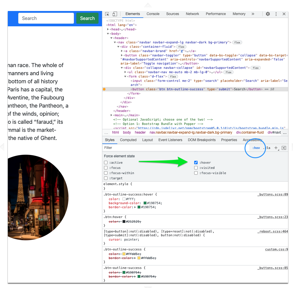
There’s a couple interesting things to note in the screenshot above. First, you can see that when the hover state of the button is selected, new style rules are being applied to the button: notice how the yellow color from our custom.css is crossed out? It’s also helpful to note that the current styles are above the styles that are being overridden. So if we want to change the hover state of our button, we can copy the entire CSS rule from the inspector window and add it to our CSS document and update the color properties with the correct hex code. We’ll use the same yellow from before along with the blue from the nav bar (see if you can find that color code on your own!). When you’re done it should look something like this:

The inspector is a vital tool to help you customize standard Bootstrap elements, so make sure to test it out!
Responsive Problem Solving
Ordering Columns
Right now, when we look at our design on a laptop or desktop device we see alternating images and text in a nice, balanced layout.
However, you might have noticed that when we shrink our browser to a mobile device size and our columns stack in vertical rows they stack as image, text, text, image. Say we wanted them to stack as image, text, image, text instead to achieve a more attractive mobile layout— how would we do that?
Back on Bootstrap’s Grid page we can learn about reordering columns so that we can control the order they appear in at different breakpoints.
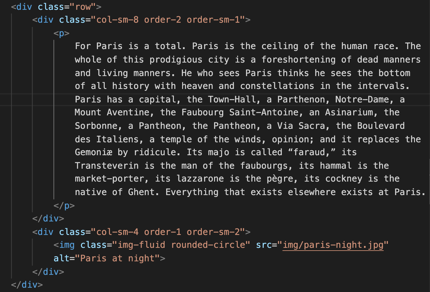
We don’t actually have to make any changes to the first row (the one with the Paris dawn image and text in it), because when it’s stacked it is in the correct order (image then text). So we need to add order classes to the columns in the second row (the Paris night image and text) to flip the order of the text and image when we’re looking at it on an extra-small mobile screen. Go ahead and add the .order classes to the columns in just the second row of the grid (see above).
Remember, Bootstrap elements are mobile-first, so the default setting for our column classes roughly corresponds with a standard mobile screen, or an extra-small breakpoint7. So when you see order-2 in the first column you can read that as “on mobile/extra-small screens this column will come second.” Next, you’ll see order-sm-1 and that translates to “on small screens this column will come first.”
Save everything and let’s look at a cool way to test that out.
Refresh your Chrome browser window and pull up your inspector again8. Here’s a handy visual to walk you through the next couple steps.
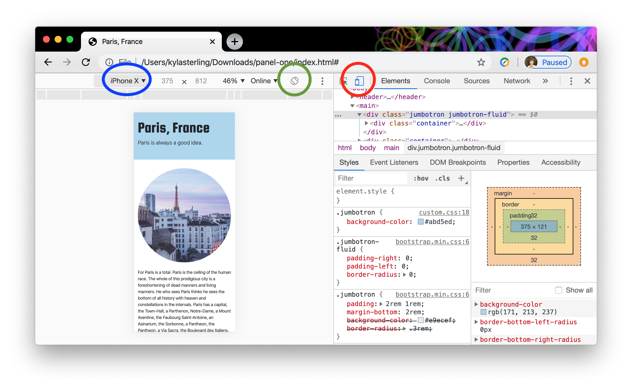
Click the device tool bar indicated by the red circle. Then, select the iPhone X from the list of devices (the blue circle).9 When viewing the screen as it would appear on an iPhone X we’re seeing how the layout looks at the extra-small breakpoint.
Click the rotate button that’s indicated by the green circle. This will rotate the orientation of your screen. A mobile phone in landscape orientation roughly corresponds with the small breakpoint in Bootstrap’s grid. Using this tool you can see how your webpage looks on a variety of device types.
What you should be seeing at this point is that we’ve fixed our ordering problem. When we’re looking at the screen on an extra-small device (i.e.: a mobile phone in portrait orientation) we now see alternating images and text.
This is another great example of how Bootstrap’s grid makes it easy for us to build responsive designs that look awesome on different device types and screen sizes.
Offsetting Columns
Offsetting columns is another tool we have when using Bootstrap’s grid. The idea here is that our row can always be divided into twelve columns, so we can alter where that column appears within the row by offsetting it by a certain value. This might sound confusing, but it’s really simple in practice.
Let’s create another row at the bottom of our container. We’ll add one column, give it a class of col-sm-8, and add a <p> element with that same text from our other <p> elements.
For the sake of this demonstration, close out of your inspector so you can view your full screen. You should see the new column with the text taking up three quarters10 of the container width.
What if we wanted to move that text over a bit? Maybe even center it? We could do that with offsetting. Add offset-sm-2 to your existing column class so it looks like this:

This is telling your browser to move the column to the right two units. Since the row can be split into twelve, this means that there will be two units, then the column which will take up eight units, and then the two leftover units to bring us to a total of twelve.
You can use offsets to help create all sorts of interesting layouts!
Note: Try testing out your page in the extra-small mobile layout again. Everything should stack neatly into vertical columns with not extra space. That’s because we’ve given the offset a “small” breakpoint! You can play around with different column widths and breakpoints to create different layouts for different devices.
Add a Media Query
As we discussed previously in our media query lesson, we can build media queries into our custom CSS to make sure our design looks great on both mobile and desktop devices. Let’s test that out in this exercise.
Take a quick look back at our browser window as it would appear on a laptop or desktop (in other words, close your inspector if it’s open and expand your screen).
Let’s turn our attention to aesthetics for a moment add a little bit of spacing between our rows so that the Paris at dawn photo isn’t sitting on top of the second paragraph.
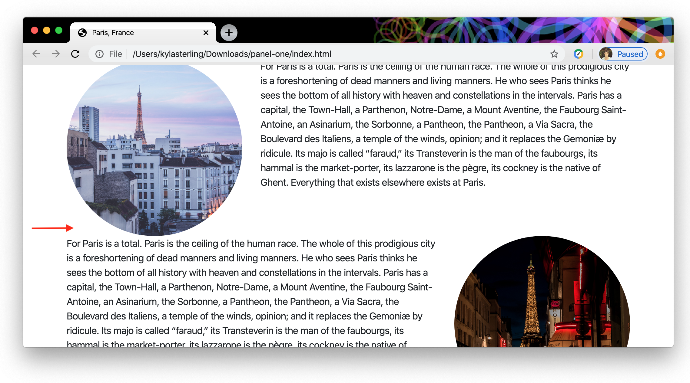
To do this we’ll add a margin to the row class by adding the following code to your CSS file.

You’ll notice that we used the same relative length unit, rem, for our margin as we did for our font size. Again, that will help our website behave responsively to browser settings.
Go ahead and save your changes and then refresh your browser window. At this point our layout looks pretty good in on a laptop or desktop, but when we use the inspect to look at our screen on an iPhone X, we see there’s room for improvement.
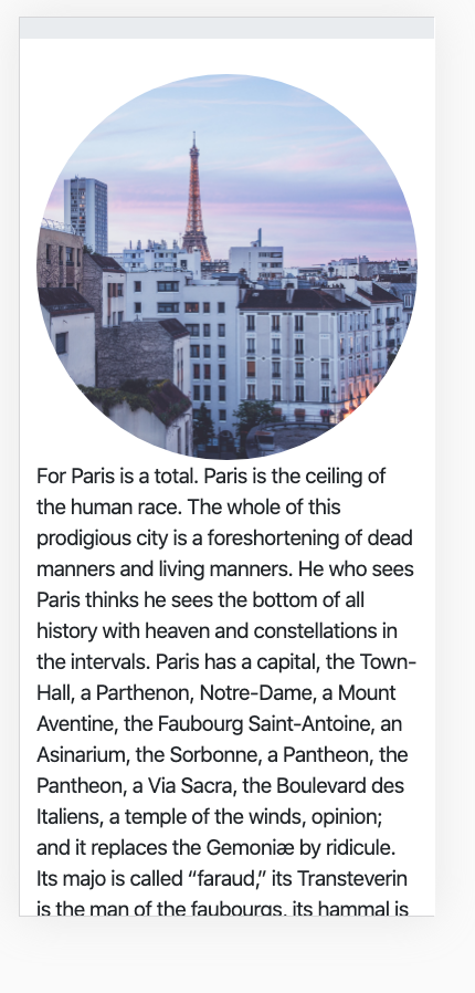
In particular, the text is a bit too big, and our columns need some space between them, just like our rows did in a bigger view. We’re going to use a media query to address these problems.
On Bootstrap’s Layout Overview page there’s a section on media queries. We’re looking for a query that says “When we’re looking at an extra small device (less than 576px) make these changes.”
Here’s the query we’re going to use:

Remember that a media query is sort of like a stylesheet inside a stylesheet. It will come right at the bottom of our CSS document and needs to contain selectors and rules that will be applied when the conditions of the query are met— in other words, in this case, when the screen in less than 576px.
The font size will be easy to fix. We will set our <p> element’s font size to 1rem, so that it’s a bit smaller on mobile view. Our code will look like this:

The column margin will take a little more work. Specifically, we want the columns with the images to have a bottom margin of 1.5rem. Let’s make that happen by creating a new class so we can apply that rule to those two particular columns. To create a new class we will simply add to the existing classes styling those columns. We’ll call the new class mar-bottom and apply it like this:
The Paris at Dawn column will look like this:
<div class="col-sm-4 mar-bottom">
     <img src="img/paris-dawn.jpg" alt="Paris at dawn" class="img-fluid rounded-circle">
                </div>
And the Paris at Night column will look like this:
<div class="col-sm-4 order-1 order-sm-2 mar-bottom">
     <img src="img/paris-night.jpg" alt="Paris at night" class="img-fluid rounded-circle">
                </div>
That’s our HTML taken care of. Let’s add the new class to our media query.

Save everything at take a look at your mobile view: the font should be a bit smaller and we now should have some space between our images and paragraph text— definitely and improvement!
Wrapping Up
First, if you made to the end of this exercise, nice job! Not only are you dedicated to understanding responsive web design, you have also found an Easter egg! Go ahead and send me a screenshot of whatever you just created!
We’re going to call it a day on this exercise, but there’s still a lot you can do on your own if you want to keep exploring! Maybe play around with the column margins a bit more, bring in another font for your paragraphs, or add some more Bootstrap components!
Remember, you can revisit this page to refresh your memory on all the different topics that we covered in this exercise.
Lastly, if things didn’t quite match up or you go stuck at some point, you can check your work against the finished code that is included on page 2.
If you get lost you can check out the finished HTML and compare it to what you’ve created, but try to save that as a last resort!↩
Remember, containers contain rows which contain columns↩
Need a refresher? Read up on the Bootstrap grid.↩
You can use the Preview function on a Mac (or any image editing software) to crop a rectangular image into a square.↩
Got it? If not, scroll to “Brand” and stop when you see “Adding images to the
navbar-brand…”↩Why is the order important? Because your browser reads your document from top to bottom. First it needs to load the bootstrap.css stylesheet, then the Google Font stylesheet, and the finally the custom.css stylesheet.↩
Revisit the the different breakpoints by checking out the Grid Options table↩
right click and select “inspector”↩
You’ll see in the device drop down that you can test the layout on a variety of mobile devices; feel free to try some out, but come back to iPhone X for this example.↩
Or 8/12ths, to stick with our grid↩