
You’ve already been introduced to Bootstrap’s powerful grid in an earlier lesson1. It can be a little tricky to really understand how the Bootstrap grid works without seeing it in action. This exercise will give you some hands on practice implementing the grid and creating a simple layout.
Set up your starter template
First things first you’ll need to create a folder called “grid” in your playground folder in your Dropbox. Inside that folder create another folder called “img” and a folder called “css.”
Open Visual Studio Code, create a new HTML file, and save that file in the “grid” folder as “grid-test.html.”
Add the Bootstrap starter template to your HTML file.
Next, visit the grid page on getboostrap.com to copy the code from the “How it Works” example. If you hover your mouse in the top right corner you’ll see “copy.” Copy the code and paste it into your HTML file below the <h1> tag. See below!
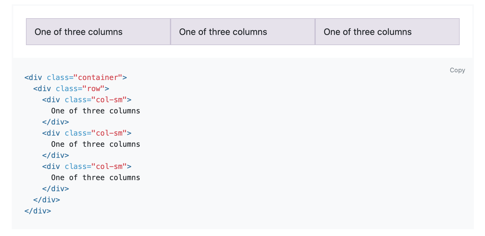
Paste it like this:
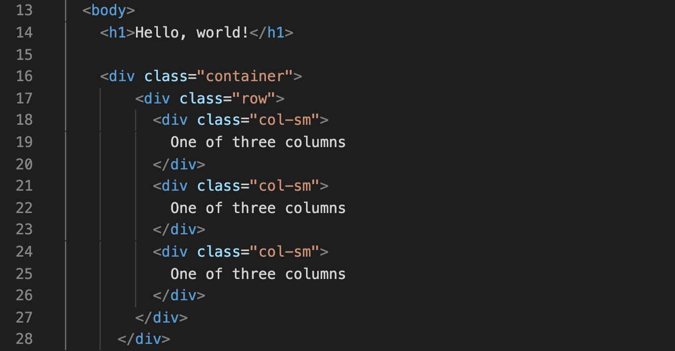
Okay, so at this point we have a container with a row and three columns.
Before we move forward with this exercise, we need to stop and make sure we understand what’s going on with all those <div> tags and class names. Take a few minutes and carefully read the explanation under “How it Works” and this bit on “Applying the Grid” from the earlier lesson.
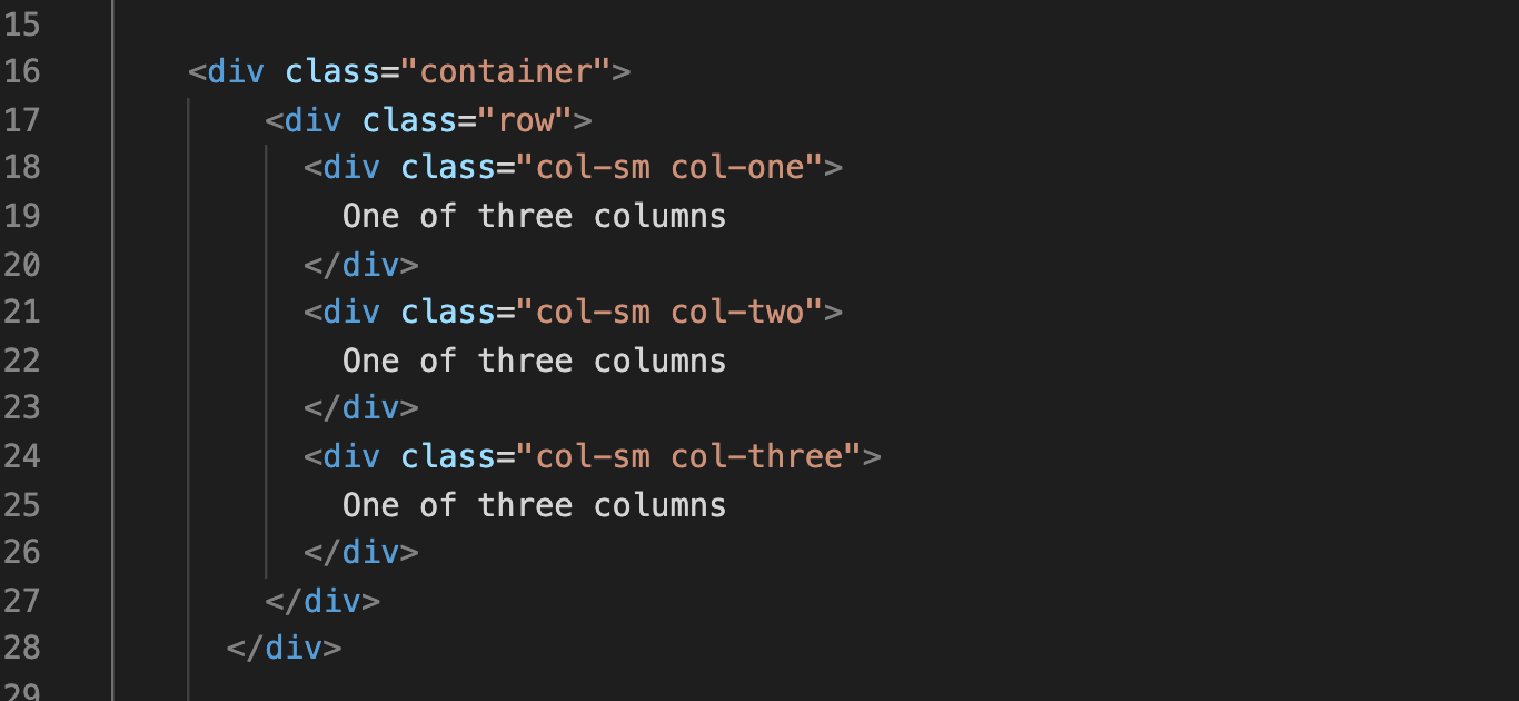
In order to visualize what’s going on with our columns we’re going to give them three different background colors. To do this, we will simply add a new class for each column: “.col-one,” “.col-two,” and “.col-three.” Add them to your HTML so that it looks like this:
To add the background colors we are going to need to add a new stylesheet to this document. Follow the steps below to get that set up.
- Create a new file in VS Code and save it as “grid.css” in the CSS folder inside of the grid folder.
- Link that stylesheet to your HTML file by inserting the following code under the bootstrap stylesheet
.col-one {
    background-color: aqua;
}

.col-two {
    background-color: lightcoral;
}

.col-three {
    background-color: lightgreen;
}
Experimenting with column size
Okay, time to have some fun with columns! Let’s experiment a bit. First, try changing the column sizes from small (col-sm) to medium (col-md) or large (col-lg). Save, refresh your page, and make your browser window smaller and larger. Did you notice how your columns’ breakpoints changed?
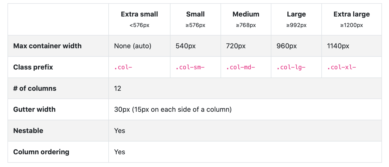
You can make deliberate decisions about your breakpoints by consulting Bootstraps “Grid Options” table. I’ve copied it below, but it’s also on the Bootstrap website.
Now, let’s change all our columns medium (col-md) for this next bit. Remember that each row is divided into twelve possible columns. By default Bootstrap will automatically divide those columns equally. Right now we have three columns and each is taking up one third of the width of the container.
What if we want one column to be bigger than another column? We can easily assign it a size in relation to the other columns. If we want the middle column to take up half the container width we can change the class to “col-md-6“2. Try it and see what happens!
You might not notice anything when your columns are stacked vertically, but you should see a change once they are horizontal. Make the browser window bigger and smaller to test this out.
Try changing the class on the first and third column to “col-md-3.” Save, refresh, and try adjusting the size of your browser’s screen.
You should NOT see any changes this time! Why is that? Because when a column isn’t explicitly numbered it will automatically split the remaining space evenly between the remaining columns. Three and three is half of six, so that’s the same result as one col-md-6 and two col-md.
Try out a few different options! You can do any combination of numbers as long as any explicitly numbered columns add up to twelve3. To keep the flexbox technology that powers the grid working properly just remember that twelve is the magic number!
Adding an image
Okay, that’s all great but we probably aren’t going to spend much time just making grids with different background colors. Time to really see this grid system in action.
In your HTML document delete the third column, making sure to delete its content and the closing </div> tag. We can also get rid of the extra classes that we made to apply the background color, too.
Add an <h1> and <p> tag in the second column and add some content to those tags. In this example, I’m writing about red pandas, but you can write about anything you like.
Now, let’s add an image. I went to Unsplash.com and found this picture of a red panda. You can use any picture you like, but make sure that it’s a big image (at least 2000px on it’s longest side).
- Rename the image to something concise and easy. I named my image “red-panda.jpg”
- Move your image into the “img” folder that you created inside of your “grid” folder.
- Add your image to your HTML file so that it’s in the first column. While you’re at it, make that a
col-sm.
You should have something that looks like this:
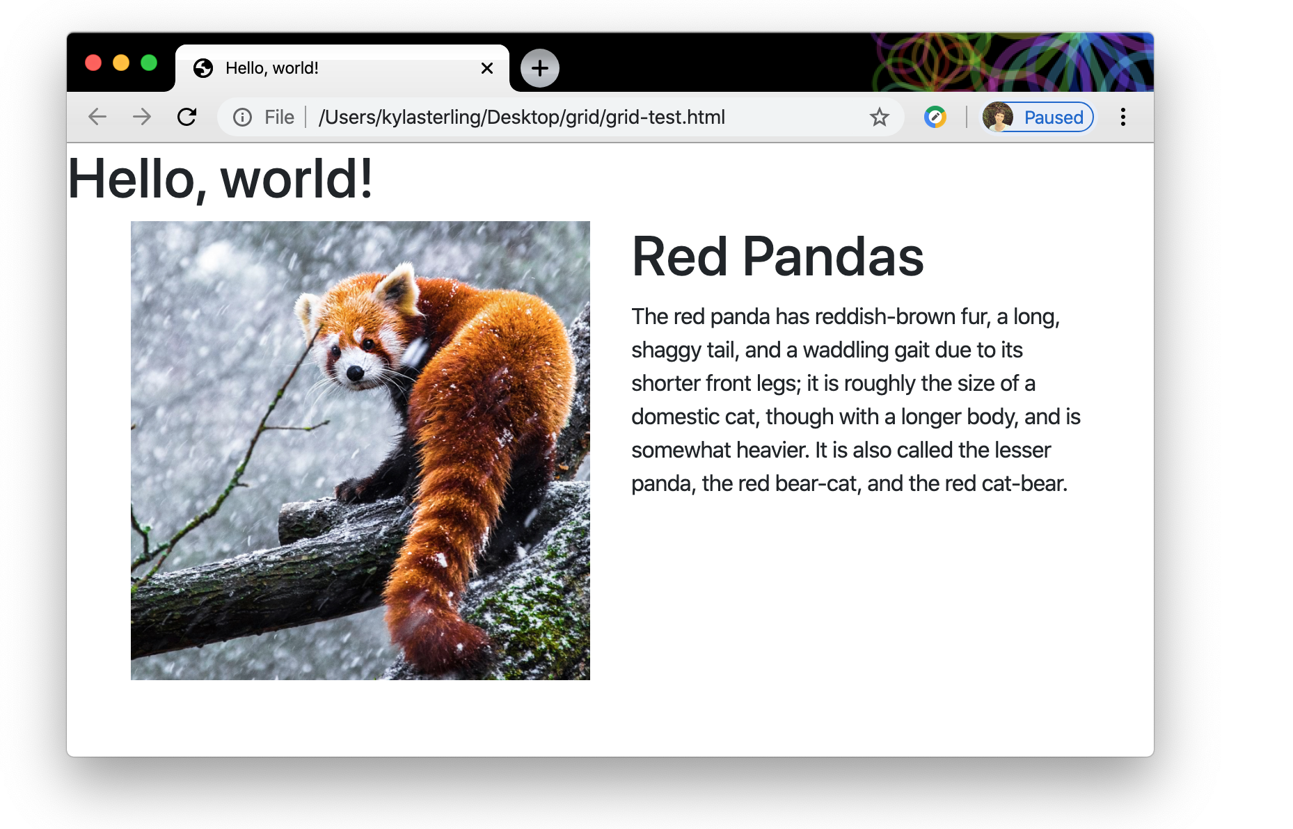
Go ahead and save your file and refresh your browser. At this point you should see your photo and text and they should move from horizontally aligned to vertically aligned at the breakpoint, but when you change the size of your browser window you might notice that the photo isn’t behaving responsively. That is, it isn’t getting bigger or smaller depending on the viewport size. Let’s fix that!
Back on Bootstrap’s website, we’ll click on “Content” and then “Image” to find the class that we need to make this image responsive.

img-fluid” makes images responsive in Bootstrap. We can paste that class into our image element like so:
<img src="img/panda.jpg" alt="A red panda in the snow" class="img-fluid">
Now, save and refresh and see what happens when you try resizing your browser screen. Your image should respond to the size of the viewport.
At this point you should have a pretty good idea of how the Bootstrap Grid works and how you can use it to create responsive layouts.
We’ve created a layout that’s pretty simple, but you can get much more complex with Bootstrap’s grid system. Finish up this exercise by stacking a series of grids together and adding some Bootstrap Components to create a more realistic web page. Experiment with some of the other grid layouts available on Bootstrap’s webpage. The name of the game here is to feel comfortable using Bootstrap’s tools so take some time to explore!
When you finished with this exercise make sure your files are saved. Link them to your webdev homepage and upload them to your server.
If you’re skipping around and haven’t carefully read the introductory Bootstrap lesson, make sure to do that first! If you aren’t familiar with the Bootstrap basics, this exercise isn’t going to make a lot of sense!↩
Because six is half of twelve, right?↩
If your columns add up to more than twelve columns won’t all fit on one row. If they add up to less than twelve the columns won’t take up the whole row.↩