
For Project One you created one HTML file with all the necessary components, and then you copied and pasted that file to create two other files. This method was more effective than writing the same HTML all over again for all three of your web pages. Why rewrite something when you can just use what you’ve already created?
Web developers have been using this principle for a while now. To create websites on the fly, developers write generic code and use it for multiple websites. Efficient, right? It’s almost as if you’re pulling yourself up by your bootstraps. 1
Enter Bootstrap. Bootstrap takes this concept to a whole new level.
Bootstrap is one of, if not the, most popular web development front-end frameworks out there.
Front-end framework
The term front-end framework has two parts.
Front-end web development refers to the front of websites—the part the user actually sees. Using the building blocks of front-end web development, such as HTML, CSS and JavaScript, front-end developers create a website’s design, layout, content, and navigation. It’s the layers of a website that are seen, clicked, and interacted with. 2
A framework is a library of reusable code you can use in your websites.
You can think of a front-end framework like a box cake mix. Instead of measuring your flour, sugar, and other ingredients together, time after time, it’s easier and more time-efficient to grab a box cake mix that contains all the right stuff measured for you.
A box mix cake, however, is nothing fancy. Frameworks are the same way—they’re built using basic components. You’ll still need to take your website to the next level with elaborate frosting and sprinkles—also known as custom CSS!
Bootstrap is a free and open-source CSS framework directed at responsive, mobile-first front-end web development. It contains CSS- and JavaScript-based design templates for typography, forms, buttons, navigation and other interface components.
Wikipedia
Background
Originally called Twitter Blueprint, Bootstrap is a tool for web developers that’s been around for a while. It was created by two Twitter employees, Mark Otto and Jacob Thornton, as a way to create consistent internal tools across Twitter.
“A super small group of developers and I got together to design and build a new internal tool and saw an opportunity to do something more,” says Mark Otto. “Through that process, we saw ourselves build something much more substantial than another internal tool. Months later, we ended up with an early version of Bootstrap as a way to document and share common design patterns and assets within the company.”
Bootstrap went public as an open source, community-contributed project in 2011.
Today, Mark Otto and Jacob Thornton still maintain and contribute to Bootstrap—as does a much larger community of collaborators.
Open source
Technically speaking, if something is open source, it means it’s publicly accessible and is available for sharing, remixing, and modifying. With open source software, you won’t find any license agreements (looking at you, Adobe).
Culturally speaking, the open-source school of thought celebrates innovation, transparency, and collaboration: it welcomes wide discussion and community collaboration to evolve and develop. Open source is not about what’s mine or yours; it’s about creating something for everyone by everyone.
When you use an open source framework like Bootstrap, you’re getting to use something that’s been iterated, perfected, and updated by an entire community. You’re getting to take advantage of all this expertise—which should help solve many of the challenges you discovered when faced with your first project.
Responsive and mobile-first web design
Bootstrap is responsive and mobile-first—two terms you need to know.
Responsive web design means a website responds to the user’s screen size, landscape, and platform. Is the user accessing the site on a phone? On a phone on its side? On an iPad, or an iPad mini, or an iPad Pro?
Typically, responsive web design uses flexible-grid-based layouts to achieve this goal.
Mobile-first takes this a step further.
Mobile-first web design doesn’t say, “Let’s take this existing website we designed on a 24-inch computer and then figure out how to make it respond on mobile, using complicated media queries.”
Instead, mobile-first is a way of designing that prioritizes mobile users first and foremost. No longer are mobile users an afterthought; they’re the target audience for the design from the very start. 3
Bootstrap is both responsive and mobile-first.
How to Use Bootstrap 5
In the same way that HTML5 is the fifth iteration of HTML, Bootstrap 5 is the fifth version of Bootstrap—and the most up-to-date (technically, we’re in Bootstrap 5.3). When you’re researching Bootstrap on your own, it’s important to double-check you’re looking at materials for Bootstrap 5. Just a note though that as you navigate our class website, you might see some images that reference older versions of Bootstrap– we’re doing our best to swap all those out! The overall workflow should be the same, never fear!
You’ll be able to access everything you need to get started with Bootstrap at getbootstrap.com. Not only will you be able to download local copies of Bootstrap files, but you’ll also be able to copy and paste code for different Bootstrap components and even the starter template for your html. Before we explore getbootstrap.com, we’ll actually practice building our own starter template by following the steps below.
Let’s practice using Bootstrap.
1. Create an HTML file
Create a new HTML file, bootstrap-test.html, and save it in your webdev folder. Don’t add anything else at this point– not even your HTML boilerplate.
2. Add Bootstrap’s Starter Template
Head over to getbootstrap.com and click the purple “Read the Docs” button.
Then, navigate down the page until you see the Starter Template. Copy the entire code block and paste it into your HTML document.

That’s all there is to it! We’re ready to start creating with Bootstrap! But before we do, it’s helpful to understand why we even need a template and what some of those elements do. So let’s take a look at some of these less familiar parts…
3. Bootstrap’s CSS
There are a couple of things we want to note about the Starter Template– these are the things that make Bootstrap so powerful. The first is the Bootstrap stylesheet that’s included in the Starter Template. This stylesheet contains over ten thousand(!!!) lines of CSS that style all of the Bootstrap components (the word Bootstrap uses to describe all of its features).
Side note: This stylesheet is part of Bootstrap’s public CDN (content delivery network). We use a CDN so we don’t have to download all these files onto our own servers—we can link to the CSS, JavaScript, and other files hosted on Bootstrap’s server. If we want to download a local copy of the CSS (and JavaScript files) we can easily do so, but for the purposes of this exercise, relying on the CDN files is fine.
3. Bootstrap’s JavaScript
Many of Bootstrap’s components rely on the use of JavaScript. You’ll see that in the Starter Template, we have the choice between just one script file or two: Bootstrap’s JS files bundled with Popper or the option to include them separately. If we go with the second option it’s important to keep them in the order shown. That’s because your browser will read your HTML from top to bottom. These JavaScript files should be right before your closing </body> tag.4
Just like the stylesheet, these are from Bootstrap’s CDN—they’re linking to Bootstrap’s files.
4. Responsive meta tag
One of Bootstrap’s greatest selling features is its responsiveness and mobile-first design. Let’s take a look at the following responsive meta tag which ensures proper rendering and touch zooming on all devices.
<meta name="viewport" content="width=device-width, initial-scale=1, shrink-to-fit=no">
This viewport refers to the user’s visible area of a website. Back in the day, websites were designed to be fixed and static. These days, it’s more common to have your website scale to size depending on the device. Read more about the viewport!
Now that we understand the Bootstrap starter template, let’s add a grid and components.
The grid
Bootstrap’s powerful grid is crafted with Flexbox to create a series of containers, rows, and columns to lay out and align content. It is a twelve-column grid system.
Here’s an example of how a grid might be written. Notice everything is a container div class, then broken into rows, then placed into columns:
<div class="container">
  <div class="row">
    <div class="col-sm">
      One of three small (SM) columns
    </div>
    <div class="col-sm">
      One of three small columns
    </div>
    <div class="col-sm">
      One of three small columns
    </div>
  </div>
</div>
While Bootstrap’s grid basically offers unlimited power, it’s a little bit tricky to master. Spend some time carefully reading over Bootstrap’s grid system.
Applying the grid
Bootstrap’s grid consists of three elements, in this order:
1. <div class="container">
2. <div class="row">
3. <div class="col">
Container: The container houses the entire grid. There are two main types of containers: .container (fixed-width, responsive) and .container-fluid, which automatically resizes to be width: 100% across devices. By default, containers center content horizontally—equal padding on both sides.
Row: Rows are nested into the container for the purpose of creating rows. Pretty self-explanatory!
Columns: Columns ("col") are nested into rows for the purpose of creating columns.
In your <body>, before the <script>, add three Bootstrap columns.
<div class="container">
    <div class="row">
       <div class="col-sm-4">
         <h3>Column 1</h3>
         <p>Lorem ipsum dolor..</p>
       </div>
       <div class="col-sm-4">
         <h3>Column 2</h3>
         <p>Lorem ipsum dolor..</p>
       </div>
       <div class="col-sm-4">
         <h3>Column 3</h3>
         <p>Lorem ipsum dolor..</p>
      </div>
    </div>
</div>
Example code from W3School’s Bootstrap 5.0 Grid System.
If you wanted to add more content, such as images, you could add them anywhere in the column class:
 <div class="col-sm-4">
      <h3>Column</h3>
      <h4> Subheading </h4>
      <img src="images.jpg">
      <p>Lorem ipsum dolor..</p>
      <p>Adding all the amazing content!</p>
  </div>
Column classes & breakpoints
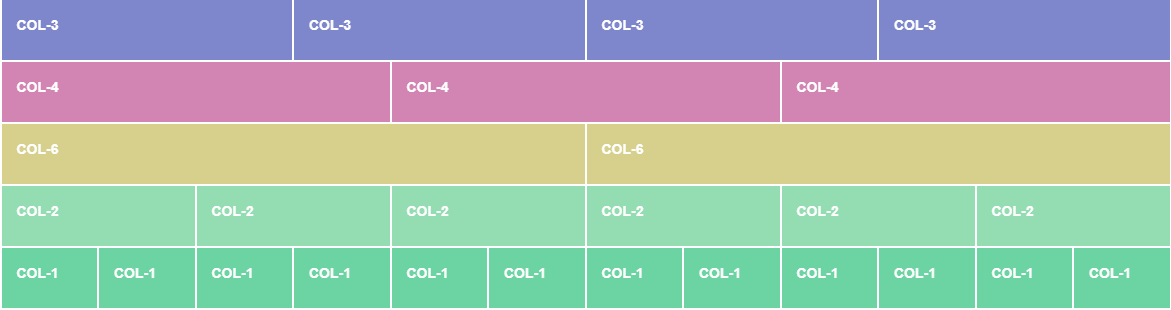
Bootstrap columns have five classes, each responsive, each representing a different breakpoint in screen size. A breakpoint is the point where the design “breaks” its horizontal layout and transitions to a layout where parts of the content are stacked on one another.
How does it work? If you were to use .col-md, it would apply to that one breakpoint and all those above it (e.g., .col-md applies to medium, large, and extra-large devices, but not the col-sm or col(xs breakpoint). Here are the five classes:
.col-(extra small devices - screen width less than 576px).col-sm-(small devices - screen width equal to or greater than 576px).col-md-(medium devices - screen width equal to or greater than 768px).col-lg-(large devices - screen width equal to or greater than 992px).col-xl-(xlarge devices - screen width equal to or greater than 1200px)
If this is a little confusing to you, don’t worry – that’s why we have visual aids. Check out this demo on the grid. Notice at which points the small, medium, and large columns “break” as you manually adjust the browser size to be smaller and larger. The large columns break (or wrap) first, followed by the medium, followed by the small.
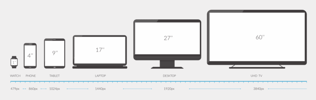
The best way to remember these sizes is to think about the common screen sizes they represent. Here’s another helpful visual guide:
Twelve-column system
Bootstrap’s grid is based on a twelve-column system. We just learned that there are column classes that determine where the column breaks, and this twelve-column system is how the grid works to keep your content looking great across multiple screen sizes. Strap in, we’re about to math a little bit. Take a look at this example:
<div class="container">
     <div class="row">
          <div class="col-sm">
          One of three columns
          <div>

          <div class="col-sm">
          One of three columns
          <div>

          <div class="col-sm">
          One of three columns
          <div>
     </div>
</div>
In the above example, if you were to multiply 4 (from col-sm-4) by the number of total columns there are (3), you’d get 12. That’s what we mean by 12 column system.
If you wanted to create a grid that had three equal-width parts out of the available twelve, you’d use .col-4. This is because 3 x 4 = 12. If you wanted two equal columns? .col-6.
The grid doesn’t have to consist of equal-sized columns. If you wanted to create two columns, one part being 2/3 width (or 8/12), and the other part 1/4 (or 4/12), you’d write it like this:
<div class="row">
     <div class="col-sm-8">
          This is using 8/12th of the available space (also known as 2/3).
     </div>

     <div class="col-sm-4">
          This is using 4/12th of the availble space (also known as 1/3). Don't worry: we aren't great at math either.
     </div>
</div>
It’s a little hard to visualize, but the point is Bootstrap’s powerful 12-column grid system is pretty comprehensive and limitless. Spend some time on your own reading about Bootstrap’s grid system.
Using components
In addition to the grid system, Bootstrap has a variety of standard components to make creating websites from scratch even easier.
In the <body> of your HTML document, add the following code for creating a navbar:
<nav class="navbar navbar-expand-lg navbar-light bg-light">
  <div class="container-fluid">
    <a class="navbar-brand" href="#">Navbar</a>
    <button class="navbar-toggler" type="button" data-bs-toggle="collapse" data-bs-target="#navbarNav" aria-controls="navbarNav" aria-expanded="false" aria-label="Toggle navigation">
      <span class="navbar-toggler-icon"></span>
    </button>
    <div class="collapse navbar-collapse" id="navbarNav">
      <ul class="navbar-nav">
        <li class="nav-item">
          <a class="nav-link active" aria-current="page" href="#">Home</a>
        </li>
        <li class="nav-item">
          <a class="nav-link" href="#">Features</a>
        </li>
        <li class="nav-item">
          <a class="nav-link" href="#">Pricing</a>
        </li>
        <li class="nav-item">
          <a class="nav-link disabled" href="#" tabindex="-1" aria-disabled="true">Disabled</a>
        </li>
      </ul>
    </div>
  </div>
</nav>
Preview bootstrap-test.html in your browser by double-clicking the file.
Now, drag the corner of your browser window to make it bigger and smaller. Notice how the navigation bar resizes into a hamburger button on smaller screen size devices? We ❤ responsiveness!
This navigation bar component is actually a modified version of the real navigation bar on Bootstrap’s component page. It’s just an example of one of the many, many components Bootstrap offers. There are buttons, badges, and dropdowns, just to name.
Check out all of Bootstrap’s components listed along the left side of the page.
Note: For these components to function properly, you must have the CSS and JS files linked—the ones we added when we created the starter template. Without those, these components are nothing more than dust (code) in the wind.
An absurd expression with a murky, complicated history. See what I mean? ↩
On the flip side, back-end web development is everything the user doesn’t see, and full stack refers to both sides. ↩
At the time, mobile-first web design was kind of revolutionary. ↩
The placement is important here! Make sure that they are right before that closing body tag!↩