What are Media Queries?
Media queries are one of the primary components of responsive design1. A media query is a specific CSS component that lets you set up extra CSS rules for different viewports or screen sizes. For example, you might want your <p> element’s font size to be 28 pixels when viewed on a desktop, but only 18 pixels when viewed on a mobile phone. A media query will let you achieve that result.
Let’s get started by looking at the syntax for a media query. Remember, this will be part of your CSS document.
Media Query Syntax
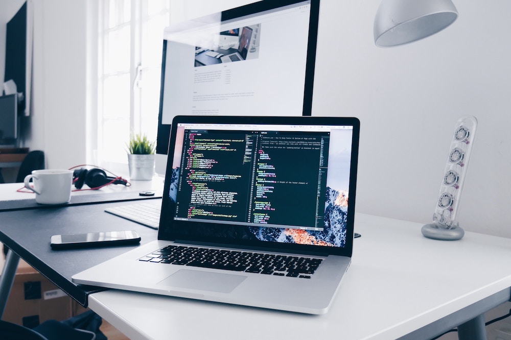
@media screen and (max-width: 600px) {
     main {
        background-color: aquamarine;
     }
}
First we will notice @media. All media queries will start this way; @media is a signal to the browsers that the browsers will need to apply new CSS rules if certain conditions are true. In this case, the conditions we are using are screen and max-width: 600px.
After the @media declaration we get the “media type.” In this example, the media query will only be applied when the media type is screen. There are several other media types we could choose from, including:
all: This is the default and means that the rule will be applied to all types of media.print: If print is selected, the CSS rules will only apply when you are trying to print a webpage. For example, perhaps you want a background image or color applied when a user is looking at the screen, but you don’t want that image or color to show up when the user prints out the webpage.screen:This rule will apply when we are viewing the page on the screen of any given device.speech:This allows us to set up rules specifically for screen readers.
Moving on, the code inside the parenthesis, in this case, the max-width, is referred to as the expression. It’s another condition we’re applying to the media query. In this case, we’re saying that this rule applies only when the screen size is less than 600 pixels. Once it reaches the maximum width of 600px the rule will no longer apply. If this is hard to visualize, don’t worry— we’ll try out some examples in a minute.
The next thing you’ll notice is that we have a CSS selector (<main>) inside the opening and closing brackets of our media query. You can think of media queries as a mini stylesheet within our original style sheet. In other words, the rules within the media query will override the default rules of the stylesheet when the conditions described by the media query are met. It helps to see this in action so let’s try it out!
Media Query Example
To get started, create a new folder called “mediatest” and save it in your playground folder. Within that folder create another folder called “css.” This will just be a practice exercise, so no need to upload it to your server.
Add some content!
Next, open Visual Studio Code, create a new html file called “mediaquery.html” and save it in your “mediatest” folder. Add your HTML boilerplate.
Copy the following code and paste it between the body tags in your HTML document and then hit save.
<main>
     <h1>I Love Responsive Web Design!</h1>
     <p>Media queries are one of the primary components of responsive design. Web design is responsive when it changes based on things like viewport size, device, and screen orientation.</p>
</main>
Add some CSS!
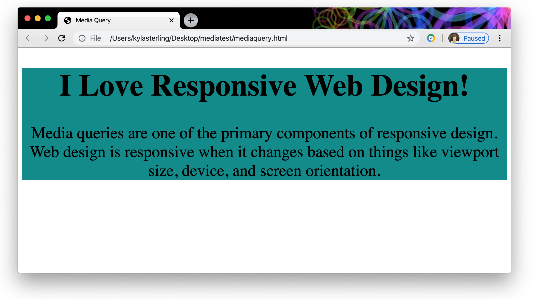
Create a new file in Visual Studio code and save it as “media.css” in the “css” folder that you created inside of the “mediatest” folder. Next, link your stylesheet by adding the following to the <head> below any other metadata:
<link rel="stylesheet" href="css/media.css">Okay, now go ahead and paste the following CSS into your stylesheet.
main {
    background-color: darkcyan;
    text-align: center;
}

h1 {
    font-size: 60px;
}

p {
    font-size: 32px;
}
Save everything and open your HTML file in Chrome to take a look at the very simple webpage that we’ve created. If everything worked, you should see something that looks like this:
Okay, that’s great—at this point we have basic HTML and basic CSS. Try grabbing the corner or side of your browser window and drag it to make it smaller or larger. Nothing much changes, right? Our webpage isn’t responding to the screen size. Well, let’s add a media query and see what we can do to make our page responsive!
Copy and paste the following media query into your CSS document below the CSS we already added. Again, we’re not erasing anything— just adding the media query below what we already have.
This is important: Your browser will read your CSS from top to bottom, so media queries should always come below your default CSS styles.
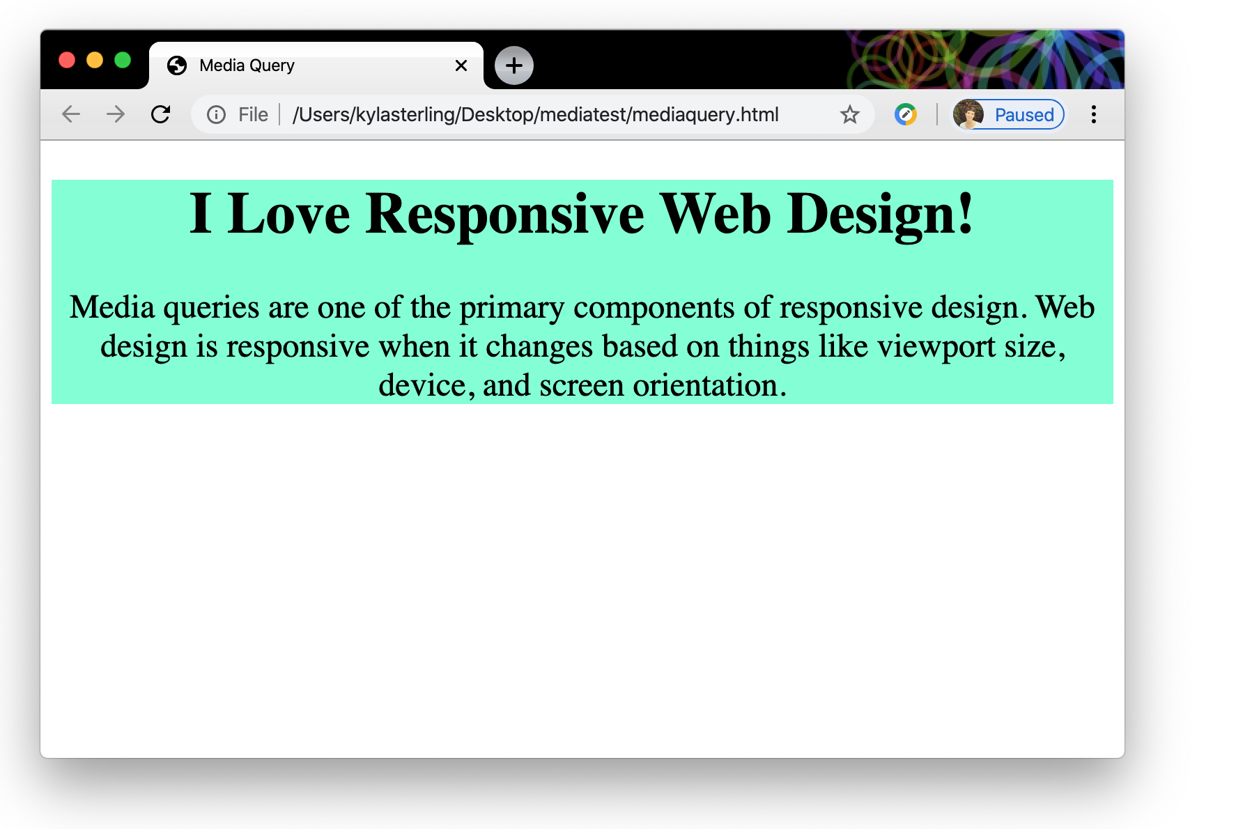
@media screen and (max-width: 800px) {
    main {
      background-color: aquamarine;
    }
    h1 {
        font-size: 42px;
    }
    p {
        font-size: 24px;
    }
}
Save everything and refresh your browser window. Now try adjusting the size of your window. You should see a different color background and smaller text when your screen is anywhere from zero to 800 pixels wide. Once it hits 800 pixels— the maximum width of our media query— the color reverts to dark cyan and the text size increases.
Are you starting to get the hang of this? If things aren’t working you can check your code against the sample code on page 2, but do your best to troubleshoot on your own first.
Go ahead and try adding another media query on your own this time. Maybe try using a min-width condition instead of a max-width and make your font size and background color change at the new breakpoint2 that you establish.
To wrap up…
Media queries are a powerful component of responsive web design. We’ll see the same basic concept of breakpoints when we dig into the CSS grid that underpins Bootstrap’s responsive design.
You may not be coding many media queries by hand in Bootstrap, but it’s important to understand how media queries allow us to create websites that easily respond to different screen sizes and media types.
To read more about media queries, check out these great references!
Reference Roundup:
Media Query Syntax: The CSS @media Rule from w3schools. This is great if you need a reminder of the correct syntax for a media query.
A Deeper Dive into Media Queries: Mozilla Developer Network has more in-depth information on using media queries here.