
So far, Bootstrap has given us all sorts of handy tools for building websites: responsive grids, navigation bars, buttons, cards, and more. But what if we want to add a little icon to our website?
Think about how often you see icons on the web. A magnifying glass tells us to search. A shopping cart holds our imaginary internet purchases. A heart might let us favorite something. Social media logos can send us to Instagram, LinkedIn, or GitHub.
We could add each of these to our website as an image, but there’s a much easier way!
Meet Font Awesome. 👋
What is Font Awesome?
Font Awesome is an icon library that gives us thousands of ready-made icons that we can add to our websites using code.
In fact, you’re already familiar with the idea of using a library. Bootstrap is a library too!
Bootstrap gives us pre-built styles, layouts, and components. Font Awesome gives us pre-built icons.
Instead of building everything from scratch, we’re learning how to use existing tools and libraries to make our websites better.
Let’s give it a try!
Step 1: Create a Font Awesome Account
Head over to FontAwesome.com.
Create a free Font Awesome account using your email address. You do not need to purchase Font Awesome Pro for this class. We’ll be working with Font Awesome’s free icons.
Once you’re signed in, we’re going to create a Kit.
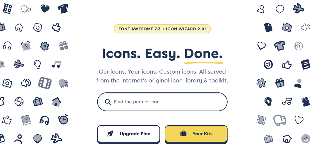
What’s a Kit?
A Font Awesome Kit is what connects your website to Font Awesome’s icon library.
Think back to Bootstrap. Before we can use Bootstrap classes like:
class="btn btn-primary"
we first have to connect Bootstrap to our HTML.
The same idea applies here. Before our HTML understands what a Font Awesome class means, we need to connect our webpage to Font Awesome.
From your Font Awesome account, navigate to Kits and create a new Kit. For this class, you can use Font Awesome’s free icons.
Once your Kit is created, Font Awesome will give you a unique line of code that looks something like this:
<script src="https://kit.fontawesome.com/YOUR-KIT-CODE.js" crossorigin="anonymous"></script>
Don’t copy the example above! Your Font Awesome account will give you your own unique Kit code.
Copy your Kit code and get ready to add it to you html document.
Step 2: Connect Font Awesome to Your Bootstrap Page
Let’s test things out. First, create a folder in your playground called icons and then create a folder inside that folder called css. Finally, in VS Code, you will create a new HTML document called icons-test.html and bring in the Bootstrap starter template.
Remember that the <head> of our HTML contains information and resources our webpage needs. You should already see things like your meta tags and Bootstrap stylesheet.
We’re going to add Font Awesome here too.
Paste your Font Awesome Kit script inside the <head> of your HTML.
Your <head> might look something like this:
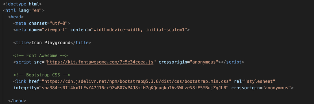
Notice that our Font Awesome script is in the <head>, while the Bootstrap JavaScript you’ve been using appears near the bottom of the <body>.
That’s okay!
Not every external resource is connected to a website in exactly the same way. Font Awesome instructs us to place its Kit embed code in the <head>, so that’s where we’re putting it.
Helpful web developer habit: When you start using a new library or tool, check its documentation to see how it should be connected to your project. Don’t assume every library works exactly like the last one you used.
Save your HTML file.
We are officially connected to Font Awesome! 🔌
But we haven’t actually asked Font Awesome to show us anything yet.
Let’s fix that.
Step 3: Bring in a Bootstrap Button
In a moment, we are going to add a button, but first let’s give ourselves a little structure to work with. Since we’ve already learned about the Bootstrap Grid, we’ll put our button inside a simple grid.
Start with a container, then add a row, and finally a column:
<div class="container mt-5">
    <div class="row">
        <div class="col">

        </div>
    </div>
</div>
Remember our Bootstrap Grid hierarchy:
Container → Row → Column → Content
Our button is the content, so it belongs inside the column:
Just to make things look a little nicer, we also added the class mt-5.
💡 What does mt-5 do?mt-5 is one of Bootstrap’s spacing utility classes. The m stands for margin, the t stands for top, and the 5 tells Bootstrap how much spacing to add. In this case, we’re adding some margin above our container so our button isn’t squished against the top of the browser window.
Okay, now, we are going to add a Button!
Head over to the Bootstrap Buttons documentation and find the example for a Primary button.
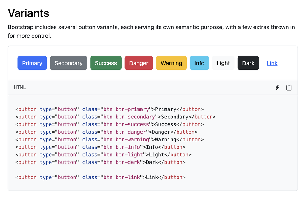
Copy the button code and paste it column you just created. Change the text from “Primary” to “Contact Me.”
You should have something like this:
<button type="button" class="btn btn-primary">Contact Me</button>
Save your HTML and preview it in your browser.
You should see a familiar Bootstrap button:
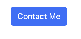
So far, Font Awesome hasn’t done anything at all!
Let’s change that.
Step 4: Find Your First Font Awesome Icon
Let’s add an envelope to our Contact Me button.
Return to Font Awesome and navigate to the Icons page.
Search for:
envelope
You’ll probably notice that Font Awesome has a lot of icons. You’ll also notice that some are available for free while others require Font Awesome Pro.
For this exercise, choose a free envelope icon.
Click on the icon.
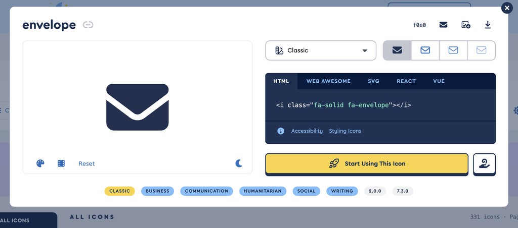
Font Awesome will give you some HTML that looks something like this:
<i class="fa-solid fa-envelope"></i>
Copy that code.
Before we put it inside our button, let’s make sure Font Awesome is working.
Paste the icon somewhere inside the <body> of your HTML:
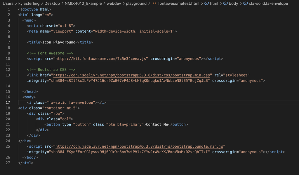
Save your file and refresh your browser.
Do you see an envelope? ✉️
If you do: Excellent! Your Font Awesome Kit is connected correctly.
If you don’t: Stop here. Don’t move on until the icon appears. Check that you copied your complete Font Awesome Kit code into the <head> of this HTML page. Then check that you copied the complete icon code into the <body>.
Step 5: What’s Happening in This Code?
Before we move our icon, let’s take a closer look at what Font Awesome gave us:
<i class="fa-solid fa-envelope"></i>
There’s actually some familiar stuff happening here!
The <i> is an HTML element.
Inside it, we have classes:
class="fa-solid fa-envelope"
fa-solidtells Font Awesome which icon style we’re using.fa-envelopetells Font Awesome which icon we want.
Do you need to memorize all of Font Awesome’s class names?
Absolutely not.
Font Awesome has thousands of icons. That’s what the documentation is for! A big part of web development is learning how to find, read, copy, understand, and adapt code from documentation.
Step 6: Add the Icon to Your Button
Now let’s bring our two pieces together.
Here’s our Bootstrap button:
<button type="button" class="btn btn-primary">Contact Me</button>
And here’s our Font Awesome icon:
<i class="fa-solid fa-envelope"></i>
We want the envelope to appear inside the button, right before the words “Contact Me.”
Look carefully at our button’s opening and closing tags:
<button type="button" class="btn btn-primary">

    Contact Me

</button>
Everything between those two tags is content inside our button.
That means our icon needs to go there too:
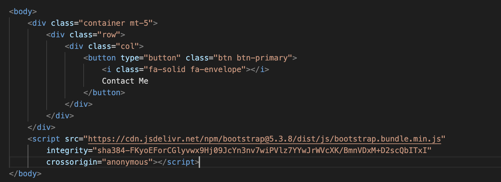
<button type="button" class="btn btn-primary">

    <i class="fa-solid fa-envelope"></i>

    Contact Me

</button>
Save and refresh.
You should now have an envelope inside your Bootstrap button.
Nice! 🎉
Wait… Who’s Doing What?

There’s a lot happening in this tiny chunk of code:
Let’s break it apart.
HTML gives us the structure:
<button> and <i>
Bootstrap gives us:
btn btn-primary
Those classes create our Bootstrap button styling.
Font Awesome gives us:
fa-solid fa-envelope
Those classes give us our envelope icon.
Three different pieces are working together to create one interface element!
This is something you’ll see more and more as you build websites. Web development isn’t always about creating every single thing yourself. Often, it’s about understanding how different tools can work together.
Step 7: A Quick Note About Icons and UX
Icons aren’t just decoration. They can help people understand and navigate a website more quickly.
Think about some icons you probably recognize immediately:
- A magnifying glass usually means Search.
- A shopping cart usually means Cart.
- A trash can usually means Delete.
- An envelope often means Email or Contact.
These icons are helpful because we’ve seen them so many times that we already know what they mean.
But not every icon is that obvious! If you choose an unfamiliar icon or use one in an unexpected way, your visitor may have to stop and figure out what it means.
That’s why pairing an icon with text can be helpful:
<button type="button" class="btn btn-primary">
    <i class="fa-solid fa-envelope"></i>
    Contact Me
</button>
Our envelope gives the user a quick visual clue, while Contact Me makes the button’s purpose completely clear.
As you add icons to your own websites, ask yourself:
Does this icon help my visitor understand what to do?
If it does, great! If it makes the page more confusing, you may be better off using a different icon or adding a text label.
Good web design isn’t just about making a site look good. We also want to make it easy to understand and easy to use.
Step 8: Customize Your Icon
Our icon works, but what if we want to customize it? Good news: we already know how to do this! We’re going to use CSS.
Right now our icon looks like this:
<i class="fa-solid fa-envelope"></i>
Font Awesome needs those classes, so don’t delete them.
Instead, let’s add one of our own:
<i class="fa-solid fa-envelope contact-icon"></i>
How many classes does our <i> element have now?
Three!
fa-solidfa-envelopecontact-icon
The first two belong to Font Awesome. The third, contact-icon, belongs to us.
Now, in order to style that icon we need to create a custom.css file in VS Code. Go ahead and do that, and name it iconcustom.css and save it in the css folder we made for this lesson. Next, we will link it in the <head> of our html document, under the Bootstrap css.
Let’s target our new class:
.contact-icon {

}
Remember: because contact-icon is a class, we use a period before its name in our CSS.
Let’s change its color:
.contact-icon {

    color: yellow;
}
Save everything and refresh.
Your envelope should now be yellow while the button text remains unchanged.
Voilà! ✨
We used Font Awesome to provide the icon, but we’re using our own CSS to customize its appearance.
Step 9: Try Changing the Size
We can also use CSS to change the icon’s size:
.contact-icon {

    color: yellow;

    font-size: 1.25rem;

}
Save and refresh again.
Experiment with the font-size value.
What happens if you use:
font-size: 2rem;
Probably a bit much for our button!
That’s another important design lesson: just because we can make something enormous doesn’t necessarily mean we should. 🦖
Try a few values and choose one that feels appropriate for the button.
Your Turn!
Now that you’ve walked through the process once, try it again on your own.
Choose another Bootstrap button and add a Font Awesome icon that makes sense for the action you’re communicating.
You might create something like:
- Download + a download icon
- Learn More + an arrow
- Add to Favorites + a heart
- Find Us + a location icon
- Shop Now + a shopping cart
Then give your icon your own custom class and use your custom stylesheet to change at least one visual property.
Before you call it finished, ask yourself:
Does my icon help communicate what this button does?
If the answer is yes, you’ve successfully combined HTML, Bootstrap, Font Awesome, CSS, and UX thinking in one tiny component.
Not too shabby!
TL;DR
Here’s the basic Font Awesome workflow:
1. Create a free Font Awesome account and Kit.
2. Copy your unique Kit script into the <head> of your HTML.
3. Find a free icon on Font Awesome.
4. Copy the icon’s HTML and paste it where you want the icon to appear.
5. Combine the icon with Bootstrap components when appropriate.
6. Add your own class if you want to customize the icon with CSS.
7. Remember that icons should help your users understand your interface, not make them solve a tiny visual riddle.
And remember: you do not need to memorize Font Awesome’s icon classes. Get comfortable using the documentation. Knowing how to find what you need is part of knowing how to build for the web.