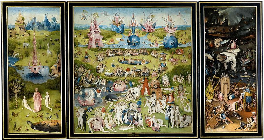
A triptych is a work of art that is divided into three sections, or three carved panels that are hinged together and can be folded shut or displayed open. (Wikipedia)
✈️ Scenario
You’ve recently been contracted by Pixel Airlines to develop a new iOS travel app aimed at Millenials and Gen-Z.
The app can be about any aspect of travel you find interesting and compelling: natural parks, like from the Figma tutorial series; best beaches; bike trails around the world; finding inexpensive flights; anything within reason that is appropriate for a higher education setting. As long as it’s loosely travel-focused!
Start ideating. Do not design your project based on your first idea. You can and should see what travel apps are out there. Notice what they have in common. Notice what they could do better. What are your dream travel plans? The sky (or space) is the limit! Creativity is encouraged. Caring about your project is required.

? PIP TIP
Take three factors into consideration. Your audience (which includes your instructor). Your main feature, or function, of the app. Your restraints. What have you learned from the Figma tutorials? What do you know how to do, and how could you expand your knowledge beyond the tutorials?
? Project Setup
- Program: Figma, of course!
- Device: iPhone 11
Task
As triptych would suggest, you’re designing one prototype, but, you’ll be building it in three distinct phases. Each phase will demonstrate your progression from low- to high-fidelity.
Phase 1: Low-Fidelity
Once you’ve selected your incredible, inspiring, awe-inspiring idea, it’s time to start putting pen to paper — literally!
Sketch out your idea on paper. At this stage, your prototype should be low-fi. You’re designing in broad strokes. Sketch out your app from the landing, or home screen, all the way through the main feature. What is the primary purpose of this app, and how will people get to it?
Additionally, start considering placement. Where do you imagine the title will go? Navigation? Buttons? Images?
Nothing needs to look polished or perfected at this stage. Think rectangles, shapes, placeholders with labels, stick figures. Color is completely optional.
For instructions on paper prototyping best practices, see this article, The Magic of Paper Prototyping. Stencils, graph paper, pens, may all help you if you’re not comfortable free-handing. Design your prototype using one screen per sheet of paper, please.
? DOCUMENT
Document your work before moving any further along! Take pictures of your sketches.
Phase 2: Medium-Fidelity
Once your wireframe is in a state where it can no longer provide value to you, it’s time to translate it to the computer.
Using your wireframe as a blueprint, prepare your file using Figma.
Create your file for the iPhone 11.
Functionality: As you start translating your ideas from wireframe to screen, start to think more in-depth about screen layout. Add a navigation menu or bar. Consider the flow of the app and how a user would progress through it.
Aesthetics: Additionally, start to make design choices. What fonts are appropriate for this? What colors? What shapes? How should the buttons appear?

? PIP TIP
Screens should be self-evident, meaning, they can stand alone without outside explanation. If a user can’t understand what they’re supposed to do without your help, you need to rethink your design.
Phase 3: High-Fidelity
Finally, it’s time to polish and perfect that prototype. Make it pixel-perfect! But first — duplicate Panel 2. Seeing your progression from Panel 2 to Panel 3 is important for grading purposes, so make a copy of your Figma file before proceeding any further. From the “Drafts” page, right click > duplicate to create a copy of a file.
Include:
- An app name
- Replace all filler text with real text
- Replace all image placeholders with real images (can be stock images; as long as they are realistic and in the spirit of an MVP. In other words, if your app has to do with hotels, don’t use the same hotel picture for everything. Make it look realistic.)
- Interactions — everything that you would expect people to click, should be clickable
- A navigation bar
- Buttons
- Iconography as needed
- Amp up your design and aesthetics by taking into account typography, sizing, overall layout, hierarchy and arrangement of elements, contrast
Translate to Slides + Submit
In the world of UX, you’ll often be tasked with creating presents to share your findings and prototypes with stakeholders. To submit this project, you’ll prepare a slide deck documenting your progression from Panel 1 all the way to Panel 3.
View example slide deck
Evaluation
| Component | Details | Points |
|---|---|---|
| Panel 1 | In the spirit of low-fidelity, students drafted paper sketches of an original and unique mobile app focused on travel. Paper prototype demonstrated a logical progression from homescreen through main feature(s) of the app. Student demonstrated creativity and understanding of cognition. | 4 |
| Panel 2 | Student translated paper sketches to Figma. Student iterated the flow, or progression, of the user through the app. Student added a navigation bar/menu and began making design decisions. | 4 |
| Panel 3 | In a different file, student transformed Panel 2 into a pixel-perfect, high-quality, polished prototype in the spirit of an MVP using Figma. Screens were self-evident. Student created an original name for the app, replaced any filler text (such as Lorem Ipsum) with real text. Added powerful imagery, made all interactions functional, added buttons, used iconography (as needed). Navigation was further finetuned. Student added more design elements, paying attention to typography, sizing, layout, hierarchy, and contrast. Student demonstrated an understanding of cognition and accessibility practices from the previous module. Attention to detail and major improvements from Panel 2 included. | 4 |
| Slides | Slides include all information outlined in the example deck. Slides included background information on the app, inspirational apps/websites, pictures of all paper sketches, and working links to Panels 2 and 3. Slides clearly outlined the student’s progression through each panel and demonstrated the student’s challenges and successes. Slides were aesthetically and strategically designed to match the prototype. Slides were error-free and well-organized. Slides included relevant screenshots from Figma and annotations to highlight important features or design elements. Slides were easy to follow. | 3 |
| Fine Print | Points are earned rather than deducted. To earn the maximum number of points per section, student must meet every requirement outlined above. | = 15 points total |