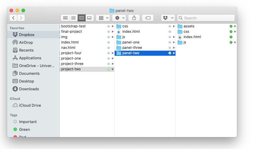
Project Two Folder and File Structure
To get started, navigate to the project-two folder in your course file structure.
Panel Folders
You’ll also see a folder for panel-one, panel-two, and panel-three.
Think of each folder for each panel as its own separate miniature site. Even though all three panels/sites will be powered by Bootstrap, each should be entirely separate from the other. Each should contain:
- Its own separate
index.html - Its own separate folder structure (i.e., a
css,js, andimgfolder) - Its own separate copies of all necessary files in those folders (
bootstrap.css, etc.)
This is an important best practice for two reasons:
- If you need to move panels around, you won’t have to worry about breaking any links to images, JavaScript, or CSS. (i.e.: your file path will always be “go into XX folder and find XX file” rather than going up and out of the current subdirectory).
- You’ll be able to compress (zip) the folder for a panel, and all of the dependent files will travel with it. This is especially helpful if you’re sending the panel to your instructor for troubleshooting!
Creating local copies of Bootstrap’s CSS and JavaScript files
NOTE: This is optional for Spring ’26 sections with Lauren Baggett. If you choose to download local copies, let your instructor know.
For this project, it’s a good idea to move from using copies of Bootstrap’s CSS and JavaScript files served by a CDN to locally stored copies. Why?
- First, it allows you to work offline. Helpful!
- Second, it reduces external dependencies. For your site to function properly when linking to CDN-hosted files, you’re betting that a server besides your own is up and running.1
- Third, the CDN files are really intended for rapid development purposes, not for production use. It’s not quite hotlinking, but the concept is similar.
Thankfully, replacing the CDN files with local copies is super easy!
Grab the Starter Template
<!doctype html>
<html lang="en">
<head>
<meta charset="utf-8">
<meta name="viewport" content="width=device-width, initial-scale=1">
<title>Bootstrap demo</title>
<script defer src="https://cdn.jsdelivr.net/npm/bootstrap@5.3.3/dist/js/bootstrap.bundle.min.js" integrity="sha384-YvpcrYf0tY3lHB60NNkmXc5s9fDVZLESaAA55NDzOxhy9GkcIdslK1eN7N6jIeHz" crossorigin="anonymous"></script>
<link href="https://cdn.jsdelivr.net/npm/bootstrap@5.3.3/dist/css/bootstrap.min.css" rel="stylesheet" integrity="sha384-QWTKZyjpPEjISv5WaRU9OFeRpok6YctnYmDr5pNlyT2bRjXh0JMhjY6hW+ALEwIH" crossorigin="anonymous">
</head>
<body>
<h1>Hello, world!</h1>
</body>
</html>bootstrap.css:
- Go to getbootstrap.com → Download → Compiled CSS and JS → Download.
- Unzip the file, go to the
cssfolder, and findbootstrap.css - Drag
bootstrap.cssandbootstrap.min.css2 into thecssfolder forpanel-one - In your
index.html, delete the CDN link (including theintegrityandcross-originattributes) and link the local copy ofbootstrap.min.css
Your final result will look like this:
<link rel="stylesheet" href="css/bootstrap.min.css">Now, we’ll work on the JavaScript file. (Again, this is optional. You can just use the linked JS)
bootstrap.bundle.js:
- If you have not already: Go to getbootstrap.com → Download → Compiled CSS and JS → Download.
- Unzip the file, go to the
jsfolder, and findbootstrap.jsand Unzip the file, go to thejsfolder, and findbootstrap.bundle.jsandbootstrap.bundle.min.js - Drag
bootstrap.bundle.jsandbootstrap.bundle.min.jsinto thejsfolder forpanel-one - In your
index.html, scroll down to the JavaScript file just above the closingbodytag. Thisbootstrap.bundle.min.jsfile will replace the script file that calls to the CDN version ofbootstrap.js. - Delete the CDN link (including the
integrityandcross-originattributes for the script file and link the local copy ofbootstrap.js- Make sure that you don’t delete the closing
</script>tag!
- Make sure that you don’t delete the closing
Once you’re done with this you can save your index.html. You now have a perfect starter template to get going on Panel One!
<! doctype html>
<html lang="en">
     <head>
     <! -- Required meta tags -->
     <meta charset="utf-8">
     <meta name="viewport" content="width=device-width, initial-scale=1, shrink-to-fit=no">

     <! -- Bootstrap CSS -->
     <link rel="stylesheet" href="css/bootstrap. css">
     <link rel="stylesheet" href="css/custom. css">

     <title>Hello, world!</title>
</head>
<body>

     <!-- Optional JavaScript -->
     <!-- jQuery first, then Popper. js, then Bootstrap JS -->                               <script src="js/jquery-3.4.1.slim.min. js"></script>
     <script src="js/popper.min.js"></script>
     <script src="js/bootstrap. js"></script>
</body>
</html>
Adding Bootstrap components and customizing with a custom.css
In much the same way you did with your Bootstrap Playground, explore the bounty of offerings at getbootstrap.com and use them to start constructing your Panel One to spec.
Then, customize your site with a custom.css3. You might even include some custom media queries!4
Panel Two
For Panel Two, you will select and download a theme. Once you do that, the next steps are pretty straightforward:
- Expand the .zip file (just double click!) you’ve just downloaded.
- Open the extracted folder.
- Move all its contents to your
panel-twofolder.
Most of the stuff in there should look pretty familiar, with the addition of an assets folder that we can explore in a bit. To tackle Panel Two, all you really need to do is open index.html in VS Code. You’ll see a reassuringly familiar HTML file with lots of standard Bootstrap components:
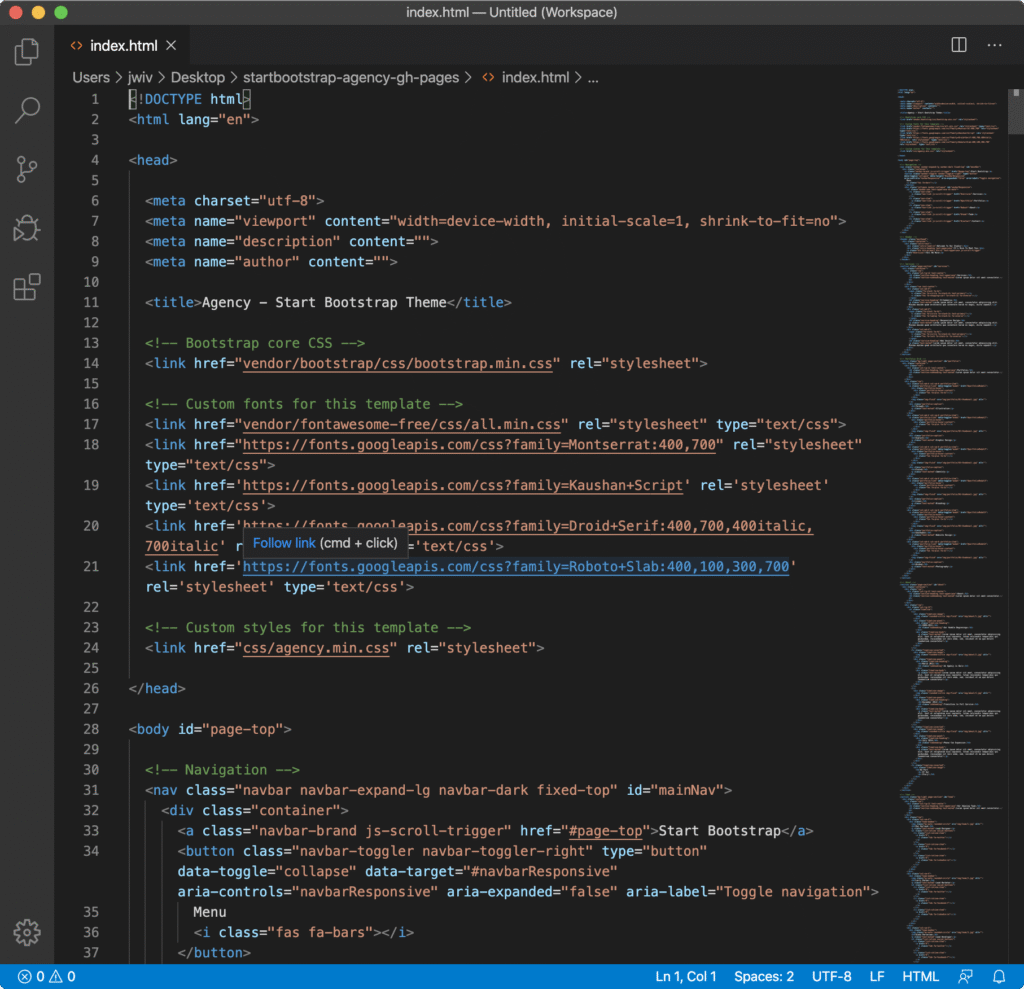
As you continue scrolling, you’ll see some theme-specific ids and some classes with fa in them that refer to the icon font Font Awesome, but for the most part, everything should be pretty accessible to you at this point.
Proceed with moving your content from Panel One index.html over to the Agency theme index.html in your Panel Two folder. You’ll need to make a copy of any images from Panel One that you’d like to use in Panel Two—they’ll go in the theme’s img folder, which is located in that assets folder.5 Remember, you can reconfigure and add any HTML you’d like for Panel Two, but no changes to CSS or JavaScript are allowed.
Before moving on, a solution to one small puzzle many of you may encounter. Many Bootstrap themes use the CSS background-image property to set a full-width background image, often at the top of a page. This is easy enough to update in CSS—but wait! We’re not allowed to touch CSS for this panel. Thankfully, there’s a simple, elegant solution to this conundrum. For those of you who like puzzles, I’ll put the solution in a footnote at the end of this sentence so you can try to solve it on your own.6
Once you’ve completed moving your content over to Panel Two, it’s time to proceed to Panel Three.
Panel Three
The first step of Panel Three is super straightforward. In your panel-two folder in Finder, select all your files (Cmd + A), copy them (Cmd + C), navigate to your panel-three folder, and paste them in (Cmd + V).
From here, there’s really just one required step: add a custom.css as the last linked stylesheet, and begin customizing your theme to your heart’s content. The only difference here from just customizing vanilla Bootstrap is that you’ll also have to contend with your theme’s custom CSS, but the process is no different in kind than what you’ve already done—just a bit larger in scope.
Pro Tips
A few commonly encountered issues that go above and beyond what we’ve already covered:
- Have a fun animation on your page that you want to customize, like say text being typed out and deleted? To edit it, you’ll likely need to go spelunking around in your theme’s JavaScript. This is doable, but proceed with caution, and don’t hesitate to ask your instructor for help!
- Many one-page Bootstrap themes use fancy smooth scrolling between sections. This often relies on matching between a link and a specific element
idas the anchor for that link. Each theme is different, but if you carefully study how the existing structure works and mirror it, you should be fine. But again, feel free to ask for help. - As you work on Panel Three, you’ll definitely want to lean heavily on the Inspector Gadget lesson to utilize the Dev Tools in Chrome. This might seem a little confusing or complicated at first, but work through the tutorial until you feel comfortable. Again, help is available if you get stuck– but try this out first!
- Customizing the colors and fonts is a great start, but don’t forget that you can add things like borders, adjust margins, and lots of other cool things. Use Free Code Camp as a reference, or strike out on your own and explore some uncharted territory!
- Don’t forget to make sure the mobile view of your page looks amazing too! You can change up the CSS on your mobile view by adding a media query. Not a bad way to earn some qualitative points on this assignment!
Granted, this is a reasonably safe bet, but still, it’s easy to de-risk completely!↩
Why include both? (We’ll go through this again for the JavaScript in a minute, too.) The non-minified version of the files is easier to read if you ever need to look through them to learn more about how they work, but the minified versions load more quickly. So, non-minified files for reference, and minified files for performance.↩
Remember, your custom.css will be added to your HTML document right under the bootstrap.css stylesheet↩
If you’re extra-good and promise only to look at it for reference and not just copy and paste, here’s a start of a sample Panel One that’s headed in the right direction.↩
Be sure to make a new copy of those images here—don’t just move them!↩
The answer? Inspect the
divwith thebackground-imageproperty applied to it to find the image’s file name and file path (for example,img/header-bg.jpg). Then, save whatever image you want to replace the existing image with to your desktop and rename it to have the same file name (in this case,header-bg.jpg). Finally, move your new image, now with the same file name, into the folder (in this case,img) where the theme image is to overwrite it. Bam—problem solved!↩