In this exercise we will create a slideshow that displays a new card each time a button is clicked.
- Create a new project and name it something like Card Slideshow. Drag the same face cards that you used in the previous lesson into Assets.xcassets.
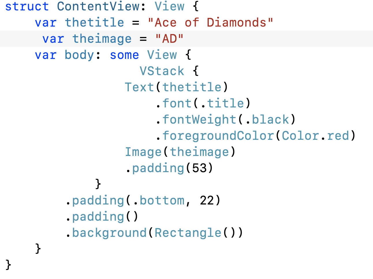
- You are welcome to reuse the code that you created in the last lesson in cards.swift, except this time put it into ContentView. Be sure and add the variables as well. Here is what my code looks like for this step. Yours may be a little different, but the important thing is that you see a card in preview and that you are using variables.

- Change your variables to state variables like this:

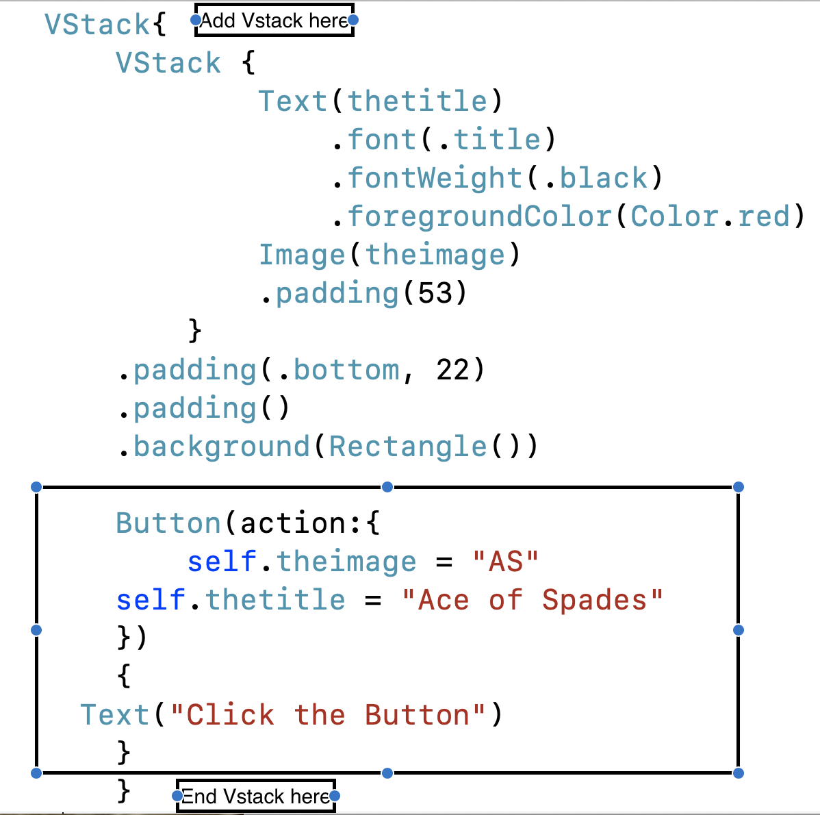
This step is necessary because we will want to change the value of our variables each time we click a button. I’m not sure why the folks at Apple who designed SwiftUI decided to make it work this way, but “it is what it is.” - Embed your current Vstack into yet another Vstack.
- Add the button shown here below the first Vstack.

- Test it out. Do you see the Ace of Spades? If not, figure out what is wrong and persist until you do!
- Next, create two arrays, one of card image names, the other of card titles, like this.

- Add yet another state variable named counter and set its value to 0.

- Modify your button actions as shown below and test things out. You should experience success until the fourth and fatal click! At that point everything will most likely crash because you reached the end of your arrays and ran out of data.

- To fix this problem, add the following conditional statement to your button’s actions, just after the line where you increment the value of counter.

The purpose of this statement is to prevent the counter from equaling the number of elements in the array. Because the first item in an array is referenced by zero, the last item in an array is referenced by a number that is one less than the actual number of items in the array. This conditional resets the value of counter to zero once it reaches that point, before it can crash your app! - One more thing and this one you are going to like. Your button is boring because at this point it is simply text. You could format the text field by changing the font, adding a background, rounded corners, etc. but we are going to take another approach. The next lesson in the textbook will illustrate how to create and apply a reusable set of modifiers known as a buttonstyle, that automatically style your button. I decided to end this exercise by giving you a buttonstyle that you can immediately apply to your button.
So here we go. Copy the text below and paste it at the very BOTTOM of ContentView, just after the ContentView_Previews struct.struct DawgStyle: ButtonStyle { func makeBody(configuration: Self.Configuration) -> some View { configuration.label .frame(minWidth: 0, maxWidth: .infinity) .padding() .foregroundColor(.white) .font(.title) .background(LinearGradient(gradient: Gradient(colors: [Color.red, Color.black]), startPoint: .leading, endPoint: .trailing)) .cornerRadius(40) .padding(.horizontal, 20) .scaleEffect(configuration.isPressed ? 0.9 : 1.0) } }Apply the buttonStyle to your button as shown below.
