It's good to be picky when it comes to UX animation.
With animation, it's easy to feel like you've done the perfect job of conveying what you are trying to say or display, but when you get to user testing you're shocked to find that some of the users either report that they wished they had seen more, or if it was confusing for them (Not speaking from experience of course *ahem*). Below are some tips to find the sweet spot, or at least a good starting point, of animation and to cover the basics of what users expect to see.
Too Quick
Like we talked about in Build Your Brand, the speed of your animation is important. It can confuse a user if they aren’t sure they even clicked anything because something appeared on the screen at lightspeed. Making sure that you don’t move too fast for a user is crucial, and this is especially important in onboarding steps when you’re telling a user how they should use your product.
Too Slow
Much like the topic above, you can also have your animations at too slow of a speed. In today’s instant gratification world, having something appear quickly and efficiently is something people have come to expect. While you do want people to have ample time to appreciate your animation or take delight in it, also make sure that you aren’t forcing people to wait longer than they need to, or you could loose user focus.
What is the average speed of animation?
Too Much


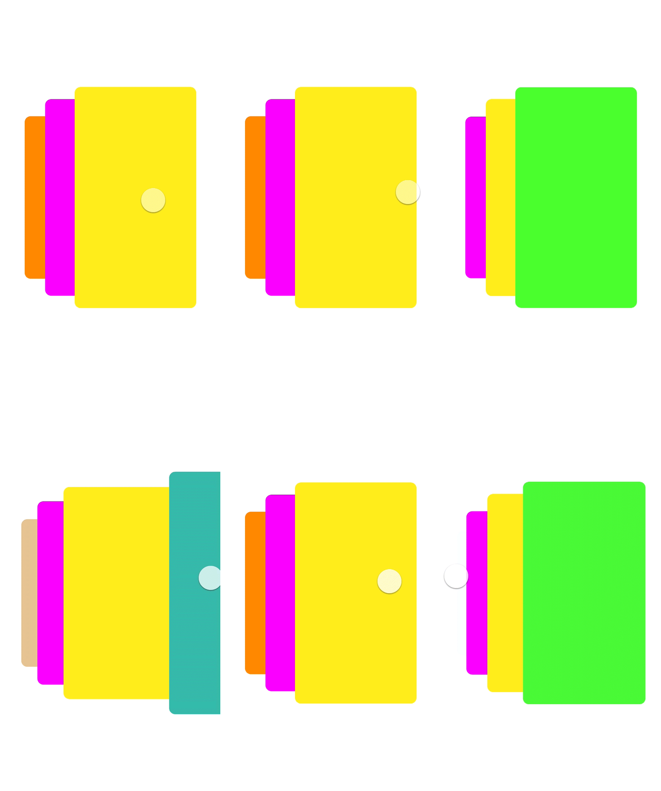
Color can be a great thing, but but have you ever heard the saying too much of a good thing? I think this applies to animation perfectly. In Build Your Brand, we talked about smart color pairings and what can really work for a brand. When you have your core colors picked out, it’s probably good to assign them each a role. If you chose navy blue, cream, and lilac it would make sense when thinking about hierarchy (Lingo 101) to use the navy as a header color, lilac as an accent, and cream as a background color. Be smart when you’re putting it all on one screen though. If you have an animation that is also lilac and it overlaps on your accent it may blend in and cause visibility issues. The same goes for a brighter color scheme like tangerine orange, fuschia, and white. The fuchsia may make a great animation color but make sure it isn’t set against the orange, or if it is have it done so in a smart way.
Too Many


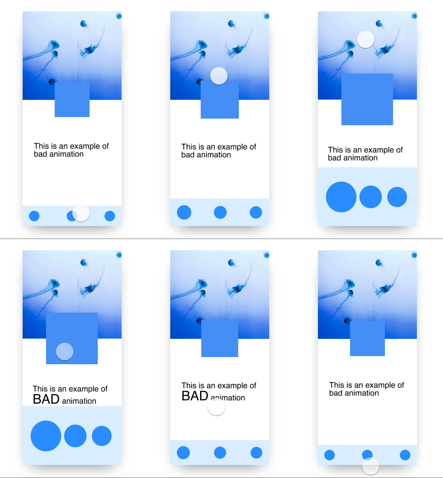
I agree that animations make things better, but sometimes you want your user to focus on one thing. Imagine you’re on a screen scrolling and there’s some nice stop motion effect, but then a gif pops up. You’re thinking "ok, this is still cool I just may need to slow down and really focus." Then, text starts sliding in. Now you’re frustrated, trying to focus on three moving objects instead of one. That’s what can happen with animation, and designers can be too deep in the design process to see it. A good rule of thumb is using the hierarchy tool. Have one big animation at a time, and very small subtle ones, if any, to accompany it.
Too Few
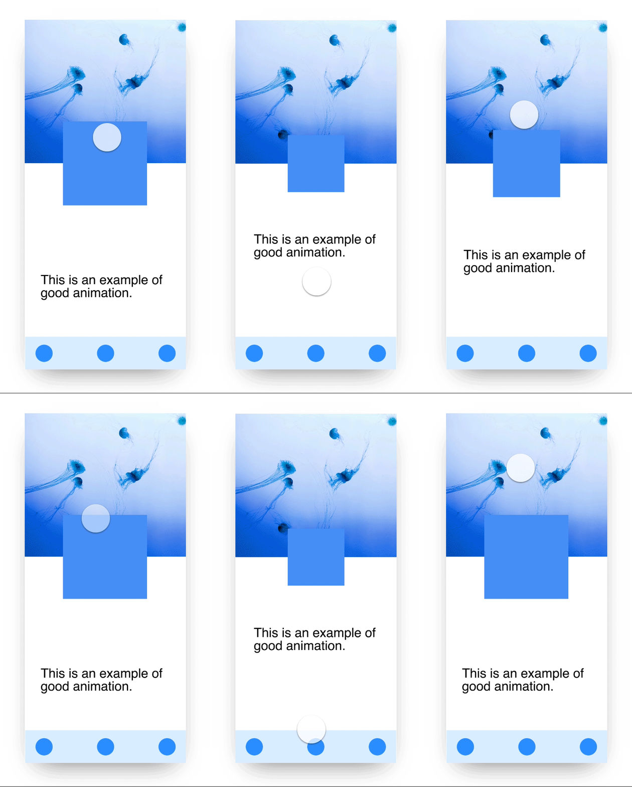
Vice Versa to the “Too Many” topic above; you don’t want to underwhelm a user, especially if they’re expecting animation. Make sure your show stopper animation shines. You can do that by making the animation quickly take up the whole page and shrink, slide in from the side to show a user something is happening, or even move in it’s fixed position. You don’t want it competing with other things but having a motion that commands a users attention to show them something is happening can be a good thing.
s