Some need to know terms to start your animation journey.
To start off, we figured it might be useful to introduce some terms used within animation so you’ll know what we’re talking about when we say “arcs” or “secondary animation” and all that fun stuff.
The Technical
Arcs help with motion that is more expressive and less of a straight line. They aide in making any animation more believable and visually pleasing.
If you close a door (unless you’re slamming it because hey, we’ve all been there) do you have the same force pushing it the entire way through, or do you start with some pressure and then really apply a good bit at the end? That’s what easing is like in digital form, and helps make transitions look more natural.
The average speed of a natural looking animation is 200-500ms.
This can be a pop up window containing information if a link is clicked, or a message telling users a message about the process of the app. This is used in onboarding tutorials frequently; think when the background is blurry and your focus is on a small message that draws your attention to it before you continue.
These should be natural looking and quick. (I.e. think about when you hit a submit button. When it takes you to the next screen is it choppy or does it load smoothly?)
The Functional
This is becoming more and more of a requirement in today’s design world, and with good reason. Making sure things are accessible to anyone who wants to learn or use something is essential. Keep in mind accessibility the next time you’re coming up with an idea or wireframing something out.
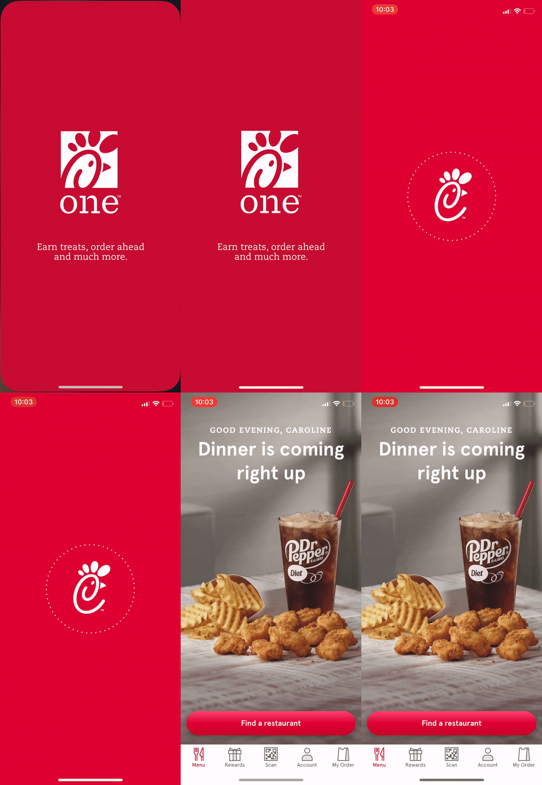
When trying to make things appear natural, this is an excellent tool. Think of when you pull down the screen on snapchat and it shows changing colors to load. You know when the color returns to blue an action has occurred, but the changing colors let you know something is happening/loading. In the gif below, you see a rotating dotted circle move to show when the Chick-fil-a app is loading.

In traditional animation, this can mean catering a colorful character towards a children's show, but an action superhero to teens. In UX animation, this can mean choosing a pleasing color palette, easy to use layout, and anything else that might make a user stop and think “Hmm, I think this is enjoyable.”
This can be a pattern, color, or picture, but it’s the plane that is the farthest back and what all other content rests on. Usually a solid neutral color is best to let other content shine and nothing is competing.
Yes, you are on the right site. No, this isn’t a page for a dance company. Believe it or not, choreography is super important in animation for a user to enjoy the process of going through the tasks you’re laying out for them to complete, and for that process to make sense logically.
What’s the most important piece of information on a page? We’re trained to read left to right, look at bigger objects first and then smaller, and so on. Creating a hierarchy with spacing and layout helps a user to know what’s important and aids in the choreography you create for your user.
This is the smoke and mirrors of your project. There are many prototyping tools out there (Adobe XD,Invision, and Marvel to name a few) that let you create clickable screens and some even let you incorporate UX animations. These are good when user testing so that you can note changes you need to make before you put in a a lot of development work.
This can really set you apart as an animator. An example of secondary motion can be if a character blinks (primary animation) and their eyelashes flutter with each blink (secondary animation). In UX design, this can be a button changing color when clicked (primary animation) and then jumping up to show the action is completed (secondary animation).
Even though it’s self-explanatory, it’s really essential to your product and making sure what you have in your head and your vision for your product matches what a user actually needs and will use. These can be done by observing a person while they complete a set of tasks with your product (in person or virtually) or getting feedback from people who have interacted with your product.
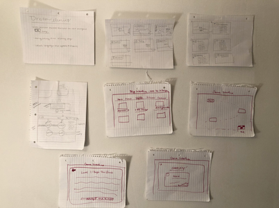
This doesn’t have to be pretty, but it needs to be neat enough to provide a good idea of where things will take place and what screens will look like. This can be done with pen and paper (in a sprint type method) or digitally.
