Things to incorporate to cultivate your brand.
Like with any design endeavor, you have to have a starting point, and with UX animation it’s no different. You have to have animations that flow and make sense to create a user experience that is clear and enjoyable.
Color Scheme


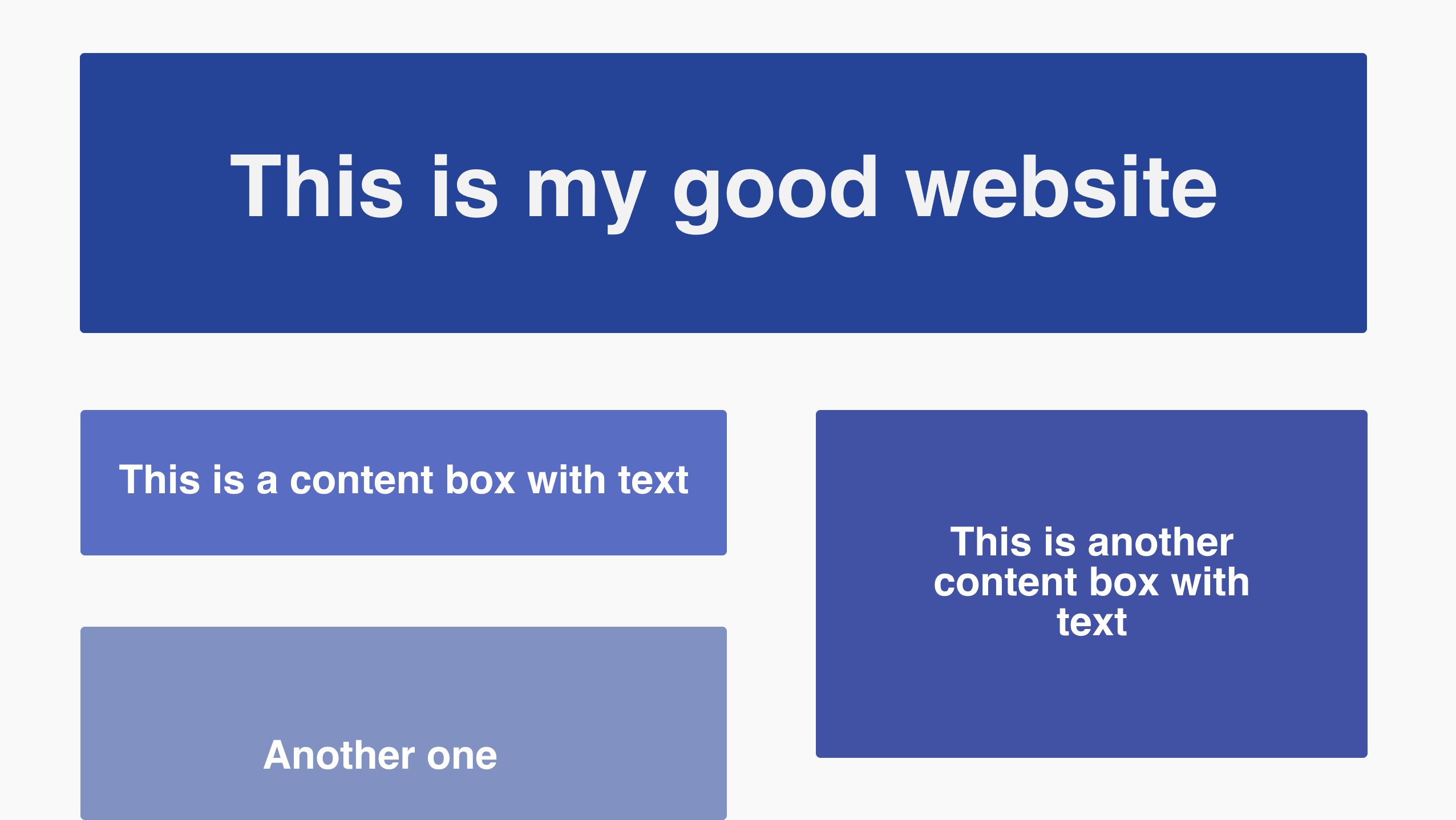
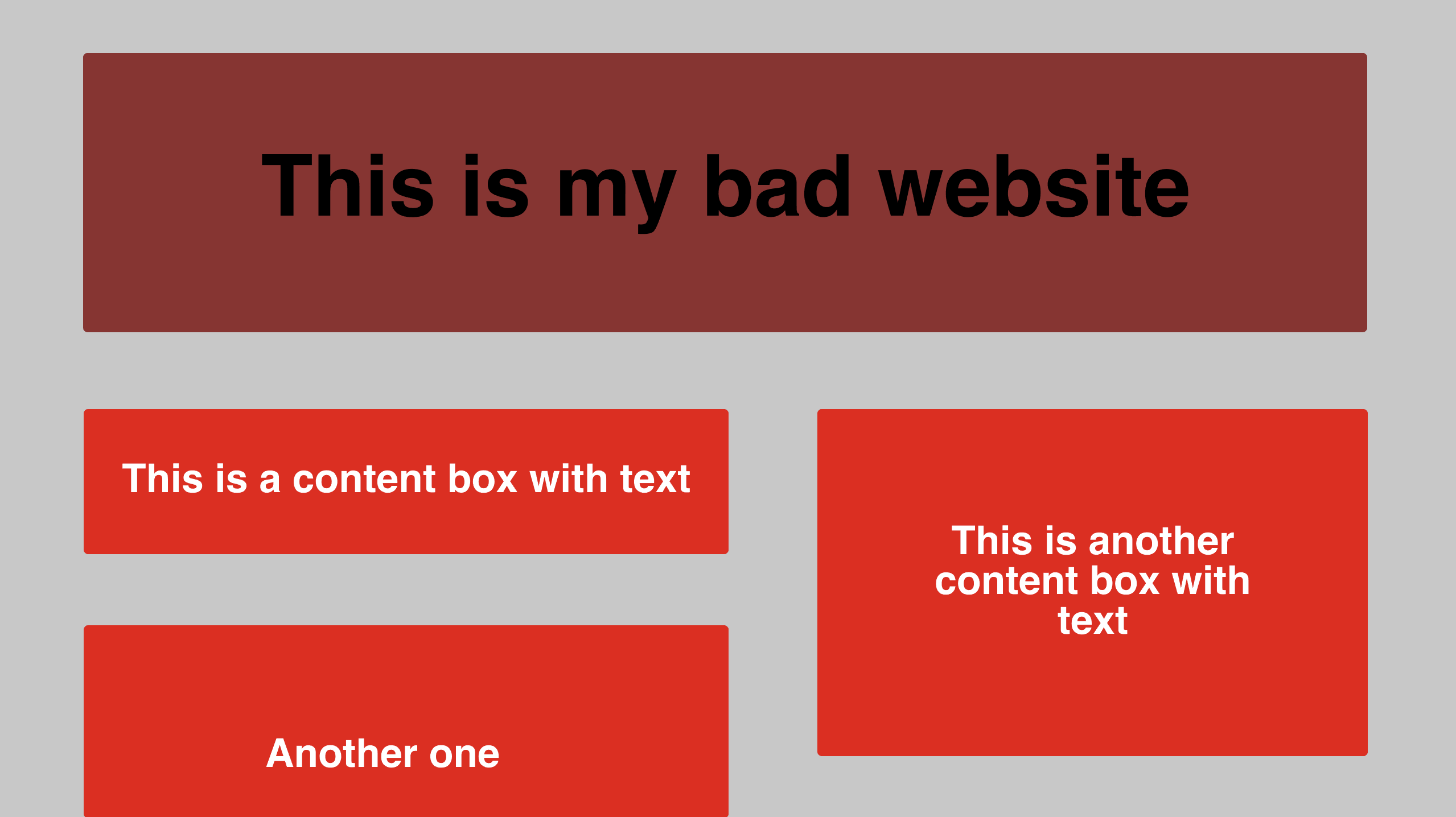
To start, a color scheme is important. When you think of iconic technology or design companies, you probably associate certain colors with them as well. Think of Google. You probably have those 4 basic colors in your head. When thinking of colors for your brand animation, consider what is easy for people to see. Bright neons can work, if you pair them with a more muted color. Black backgrounds can be intriguing, if you pair a lighter scheme on top. It’s all about balance.
Font
If you have a font you’re incorporating into any sort of animation, I think it’s a given to make sure it’s easily readable. Unless it makes or breaks your brand, it’s best to stick to sans serif or easy to read serif fonts to let the animation shine rather than having the user trying to decipher what you’re trying to convey.
Animation Speed
You’re going to really confuse your user if you have a button glide off the page and then fly away at top speed. The average speed of animation is 200 to 500ms. A good rule of thumb is 200ms or even less for smaller effects, 300ms or more for more complex animations. Make sure to be consistent in the timing (Lingo 101) so that the user knows they’re still on the right page and can focus on the content instead of figuring out why the animation is changing drastically. There are cases where changing the animation can serve you well, but make sure to do some user testing to make sure it’s successful before making hundreds of people frustrated and confused.
What is a good animation speed (in ms) for smaller effects?
Shapes

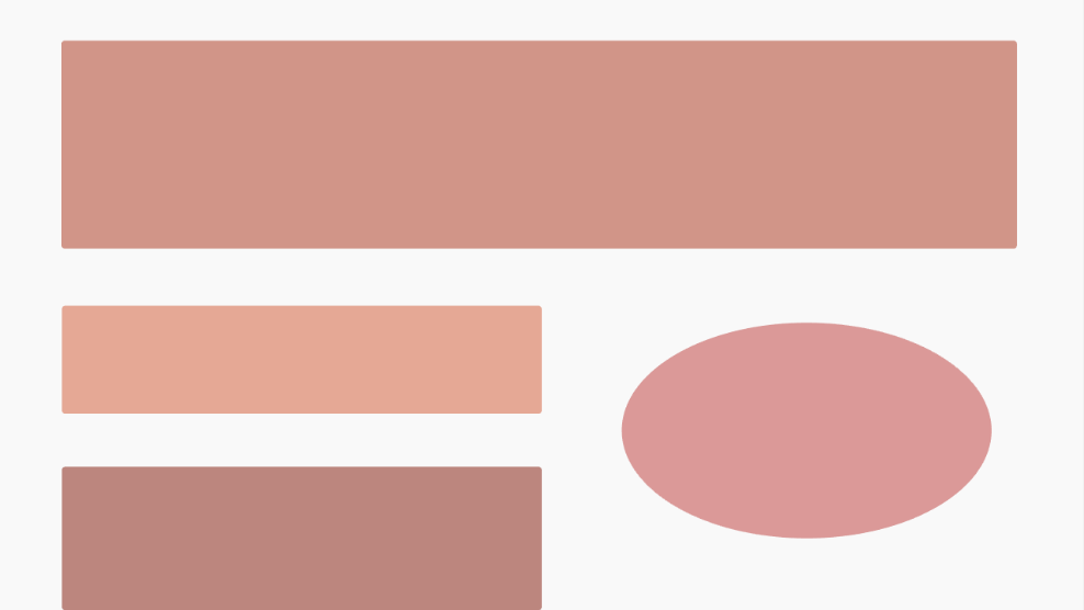
Depending on your brand and the type of animation elements you will be using, it’s important to be consistent with the type of shapes you use. For example, it would be wise if you use a soft edged triangle, to also do a soft edge with other shapes. This will help a user recognize what your core visuals are, and possibly make it to where you don’t even have to state your company name or logo if they are that distinct.
Customer Service

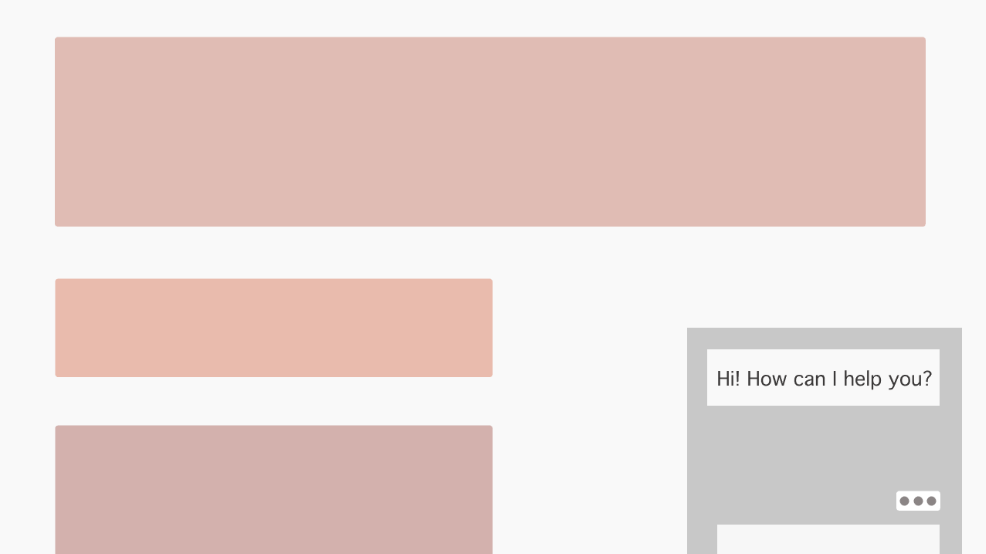
This may seem like a non-visual element, but it has the potential to really be the opposite. You may see now if you go on certain websites different chat boxes pop up, usually with a picture of the employee, stating that they are there to help if need be. This simple visual action furthers UX design, and you can incorporate animation into that by making your own version of this or having a fun way of guiding a user to an answer they need. Another idea is to make a visual, animated FAQs section. Frustration can set in seeing all the text populate on one page, but breaking it up with visual representations or screenshots of help can enormously help that issue.