An SVG, or Scalable Vector Graphic, is a text-based definition of a vector image.
Using SVGs to Create Animations
This tutorial was inspired by a tutorial from CSS Tricks
You can use CSS animations to change how these SVG lines appear, making it look like they are moving. If you haven’t done the CSS Animation Basics lesson, head back there first so we are all starting from the same place.

Creating and Exporting Your SVG
In Illustrator or another SVG creator (don’t have Illustrator? Try Vectr, a free online vector creator), create a simple vector image. Try starting with a circle or a line.
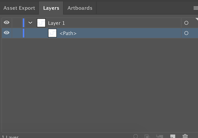
Make sure to name your path to make things easier on yourself later. This may seem trivial now, but when you’re working with a lot of different lines, you’ll be happy you made this effort. If you’re working in Illustrator, use the dropdown on the layers panel to find the list of paths.

Once you’re satisfied with your image, export your vector as an SVG file.
From here, you have two options. You can either add the SVG into an HTML file linked to an external or internal CSS stylesheet, or simply add an internal stylesheet to your SVG file. To keep things as simple as possible, we’re going to go with that second option and write our code in the SVG file.
Animating Your SVG
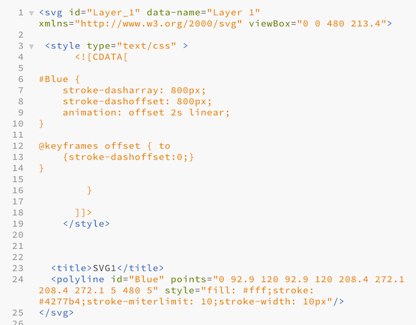
So, go ahead and open your SVG file in your code editor of choice. You should see something like this…

See where the path is identified by the label you created earlier? This helps us tell the paths apart, and allows us to target that path with some CSS properties, which is what we are about to do. The numbers that come after the path ID explain to your computer what the path is supposed to look like.
When you saw the animation above, it looked like the line was being drawn. What’s happening beneath the surface is that we added a property to the line to make it dashed, and the dash we created was the entire length of the line. So, if we move that dash around, it creates the illusion of movement. Let’s try it out.
First, we need to edit our file so that we can write CSS into the SVG. The following lines of code set up an internal style sheet in our SVG file. Copy and paste the following after the SVG tag to get started:
Now, within this section, we can start writing our CSS code. First, go ahead and select the appropriate path. In our case, this would be blue.
#pathname { }
Then we have to add a few properties to this path to allow us to animate it. We need to determine what the length of the stroke-dasharray property and the
When you have the values correct, you won’t be able to see any of the line anymore. The stroke will be offset so much that it is off the page. Now, we will set up an animation to bring it back onto the page.
Create a new @keyframes property. You can call it whatever you’d like, but here we have named it offset. What the following code says is that it’s moving the current stroke-dashoffset property, which we’ve set to make the stroke disappear from the page, to 0, which will make it appear on the page.
@keyframes offset { to
                {stroke-dashoffset:0;}
}
Now that we’ve created this, we can activate it. Head back to the selector for the path, and let’s write a new animation. Need a refresher on animation shorthand? Check out the previous lesson.
Make sure to set the animation-timing-function to linear so that your line draws the way you expect it to.
In the end, your code should look about like this…

And your animation should look something like this…

Ta-da! You did it! But that was just with one simple line. What happens with more complex paths and animations? Read on to see how you can apply this technique in different contexts.
Example: Creating Our Homepage Animation
Now that you understand how this works, you probably realized you’ve been seeing this technique all over our website.
For our homepage and subpage animations, we used a whole web of pathways that included some additional forking paths. To make the animation more appealing, we incorporated different animation speeds and delays for different lines. For the forking path effect, we used a carefully-coordinated animation delay that we found through a lot of trial and error to make it seem like the line was flowing into two different paths rather than just starting a new path.
See the Pen flUX Background by Kendall (@kalake96) on CodePen.
This Codepen shows how we built the flUX homepage background.
Application Activity
Feel ready to animate some lines? Put your newfound knowledge to the test:
- Build your own SVG line animation like we outlined above. Remember, if you don't have Illustrator, there are plenty of free options out there.
- Expand beyond the straight line! You don't have to stick with a straight line like we did; you just want to have a single path. Try drawing something in an SVG and then animating it. A few ideas: an apple, a simple flower, or a crescent moon.