Maslow's Hierarchy of Needs
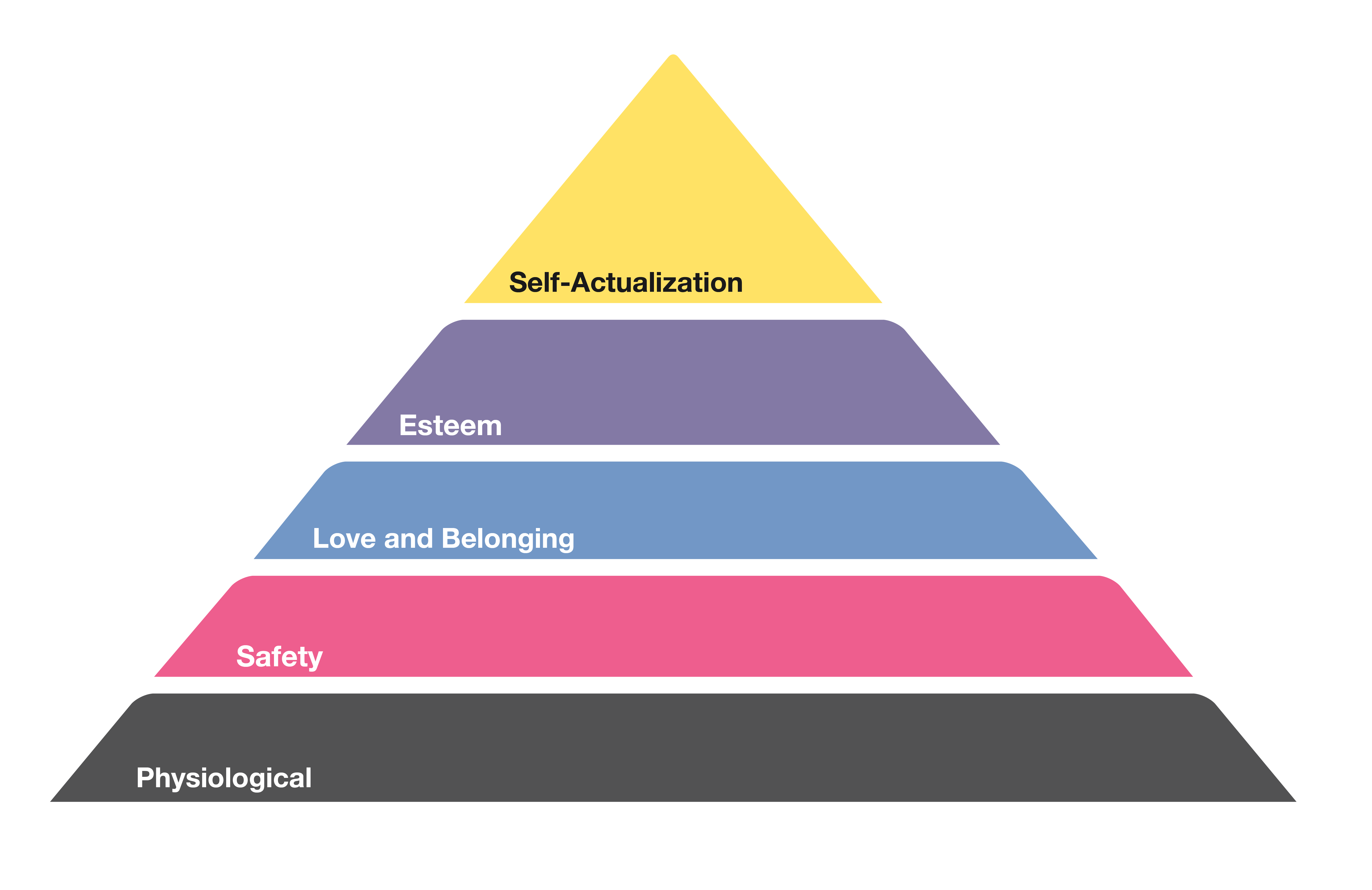
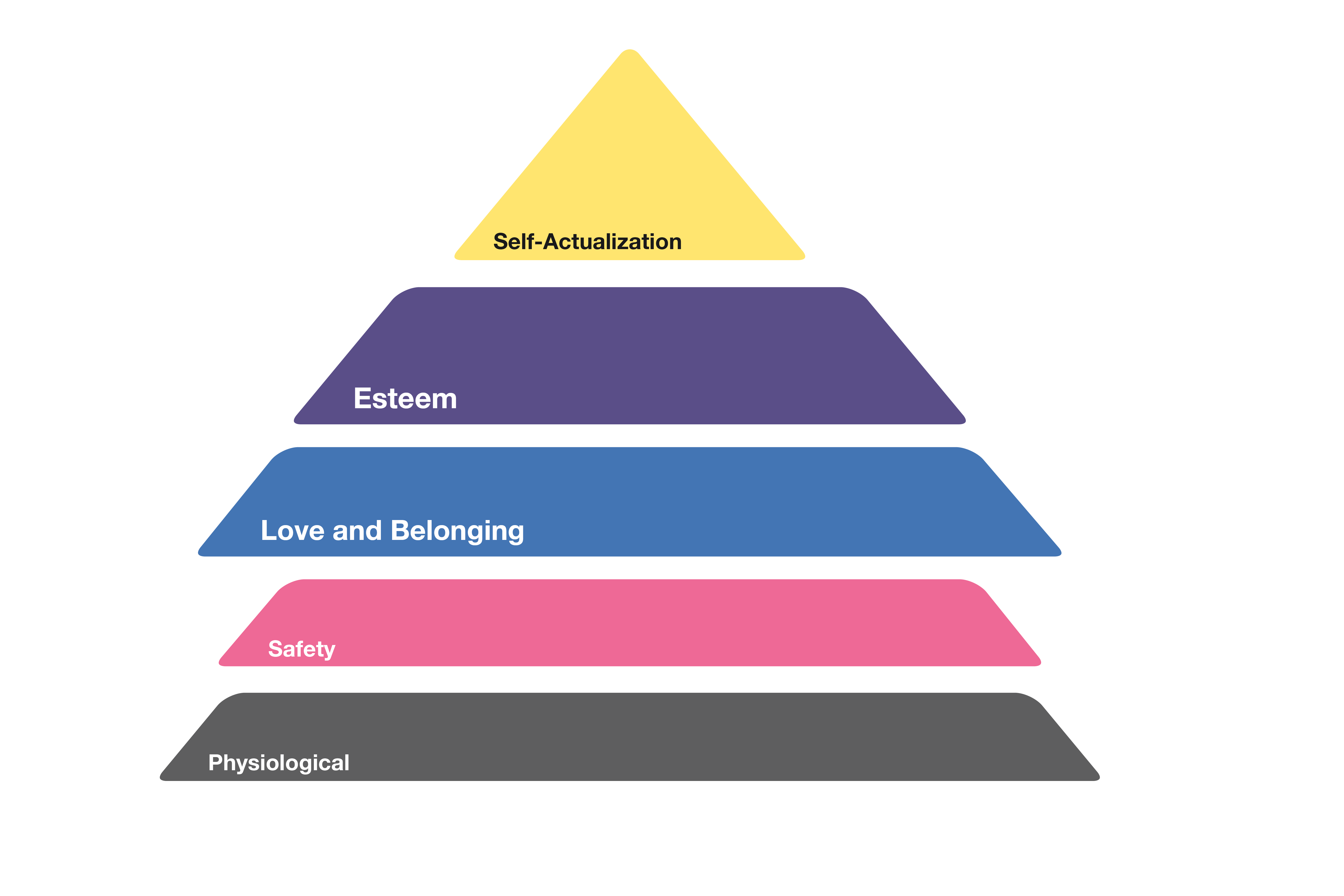
Maslow’s Hierarchy of Needs has been met with a little criticism but is still considered basic psychological canon. Abraham Maslow theorized that human beings have five categorical needs that must be met in a certain order, eventually reaching “Self-actualization,” or the ability to seek personal growth. User experience designers appeal to these needs to implement seemingly minor shifts that make all the difference in a product.

Although animation can address all of these needs in design, we will focus on love and belongingnessandesteemneeds. These two slices of the pyramid are actually referred to as the "psychological needs," sandwiched between the “basic needs” (physiological, safety) and the “self-fulfillment need” (self-actualization).

Love and belonging
Design is a human-centered effort, no matter the medium. How can animation contribute to a sense of love and belonging in UX design?
If your web/mobile experience is a house party, animation is the most gracious host. It’s the first to greet you, it points you in the right direction, and of course, it entertains.

This landing page animation by VISKA greets the user effectively and efficiently. It swiftly brings in the title and description of the product, followed by a fun, floating image. This simple movement provides subtle but necessary prompting for the user. It’s like being greeted with a handshake instead of a stare. A dynamic landing page says, “Welcome, you’re in the right place,” while a static page tells the guests to show themselves around.
After a warm welcome, animation can make sure a user doesn’t feel lost. In this dribbble shot from Ramotion, animation guides the user through each layer of the one-page site. As you scroll, items appear in a descending diagonal motion from left to right, suggesting a natural flow to the site. Each section has an element with subtle motion that grabs the user’s attention (yes, animation can say, “hey, over here!” without being as annoying as Clippy). Overall, motion leads the user through the experience instead of dropping them off at the threshold with a “have fun!”
Finally, animation keeps the party going. Motion can make mundane facts and figures sparkle in the spotlight. Whether it’s event details, a news brief, or the most complex data results, animation guides the user through the intended experience in a fun way. This dribbble shotfrom Ramotion has several great examples of creative data presentation. When you aren’t there to present with pizzaz, animation makes a suitable proxy.
Animation helps with what three things?
Esteem
How does animation help the user build confidence using a product? Give the user checkpoints. Animated checkpoints encourage a user through the intended experience.
See the Pen Material Compact Login Animation by Yusuf Bakır (@yusufbkr) on CodePen.
The most basic form of this is the log-in check mark. This simple animation gives the user a participation trophy right off the bat - as if to say, “Congrats, you’re in!”
See the Pen Pure CSS Parallax Scrolling by Keith Clark (@keithclark) on CodePen.
There are lots of fancy ways to direct a user through the intended experience, giving them checkpoints along the way. A more subtle, beginner option is the classic parallax scroll. This simple animation (that only requires CSS) subtly prompts the user to continue, well, scrolling. On this one-page site, the user gets a preview of the next section as they scroll, giving them a subconscious hint of where to go next. The parallax scroll is like running on a treadmill after training on pavement. It makes users think, “hey, I think I know what I’m doing here!”
Instead of aligning user experience design to Maslow’s Hierarchy of Needs, several designers have aligned the hierarchy to user experience design. These “Design Hierarchy of Needs” are helpful to consider before launching into product design and development.